TLDR;
Being a sociology major has proven to be useful to my design process, because iterative design helped me refine the five ideas below. I’ve encountered every one of these in different settings. The iterative design process was an opportunity to see where tech, and human-centric problems I spend a lot of time thinking about, can meet.
- there are ethical decisions to make in the design, testing, and implementation process
- accessibility and equability are important, if people can’t use your design it’s worse than useless
- you are not the end user
- focusing on the tech might mean missing the solution
- do the right thing, even if it means starting over
The first piece of advice I got going into college was “don’t major in sociology.”
I have since majored in sociology, and am awfully close to a double in philosophy. The ‘hard skills’ section of my resume lists three computer science courses, three economics classes, introductory statistics, and a whole lot of skilled trades abilities. I’m really hoping that Steve Jobs was right when he said
it’s technology married with liberal arts, married with the humanities, that yields us the result that makes our heart sing…
I’ve never thought of myself as designer before. Pre-college, I was a machinist and welder. So craftsman, sure. But a designer? That seemed like a job for people with artistic ability. Turns out, design isn’t just about making pretty infographics or app interfaces. It’s about creating functional and intuitive products that actually improve users lives. It’s about understanding the end user, as well as the potential consequences of implementing a design. And this is where my humanities degree is useful.
My Human Computer Interaction course (one of those three aforementioned CS classes) involved a group project with Chris and Kenneth. By combining our three individual proposals we came up with heART, a mobile application designed to “make data useful” for curators. We developed this project alongside UX design/research readings as a way to make the concepts tangible. However, our project also served to bring my sociology, philosophy, and “hard skills” together in a way that I had never seen before, nor expected. Somewhere in paper prototypes and stick-figure sketches, something clicked. The rest of this piece is an introduction to five areas where I think tech and the humanities collide.
Design presupposes ethical considerations.
By that, I don’t mean designers spent time calculating utility or determining the proper categorical imperatives to determine duty to guide their duty and tasks. I mean… when my group and I sat down to design and application for museum curators, we had an obligation to provide curators with the best product possible, to be transparent about their role in testing, and to be honest about our goals. When we performed contextual inquiries with students and curators, we needed to be upfront about our motivations and understand the value of their time, as well as the responsibility we had to understand their needs and wants rather than looking for ways to cement our pre-existing opinions.
More importantly, however, we had - and have - a responsibility to people who visit museums, not just curators. For example, each piece in the WCMA database is assigned a category by a curator. There are no ways to search with cross-category variables. Photographs by African artists can be in “Africa” or “photographs,” or even categorized by the photographer’s nationality. Each of these queries will produce a different result.1 Since the artwork in WCMA’s database reflects categorization bias, how could we intervene? How would our data representations help curators create more equitable, responsible, and accesssible exhibits?
We didn’t have solid answers for this. We still don’t. Or at least, I don’t. But what I do know is that conversations and reflection are essential for understanding the ethical implications (and very real ramifications) of decisions.
When starting the contextual inquiry process, we realized that we didn’t understand our users, or their issues. Curators were interested in communication.
…one of her [U1] goals was to find pieces that invoke intriguing ideas and unexpected discussion points.
most of the feedback he [U2] receives is positive, which made him worry that people who are confused or frustrated aren’t expressing this information to him. He even said he wished he could get visitor questions directly sent to his phone so he could answer them (given he had the time), that way it might eliminate some frustration… He said would like to know which galleries people liked the most, that way he could incorporate that feedback in his choices.
In our design process, we decided to emphasize communication and transparency between visitors and curators, since curators expressed a desire to communicate with and understand visitors. I believe that respectful and open communication is the first step to addressing bias, repairing damaged systems, and understanding the very real impact our actions - and interpretations - can have.2
Users have to be able to access and use products.
It sounds simple. It really does. But it’s not nearly as simple as I (and my group) expected. What seemed efficient, logical, and natural to us ended up being useless - at best - to our users. 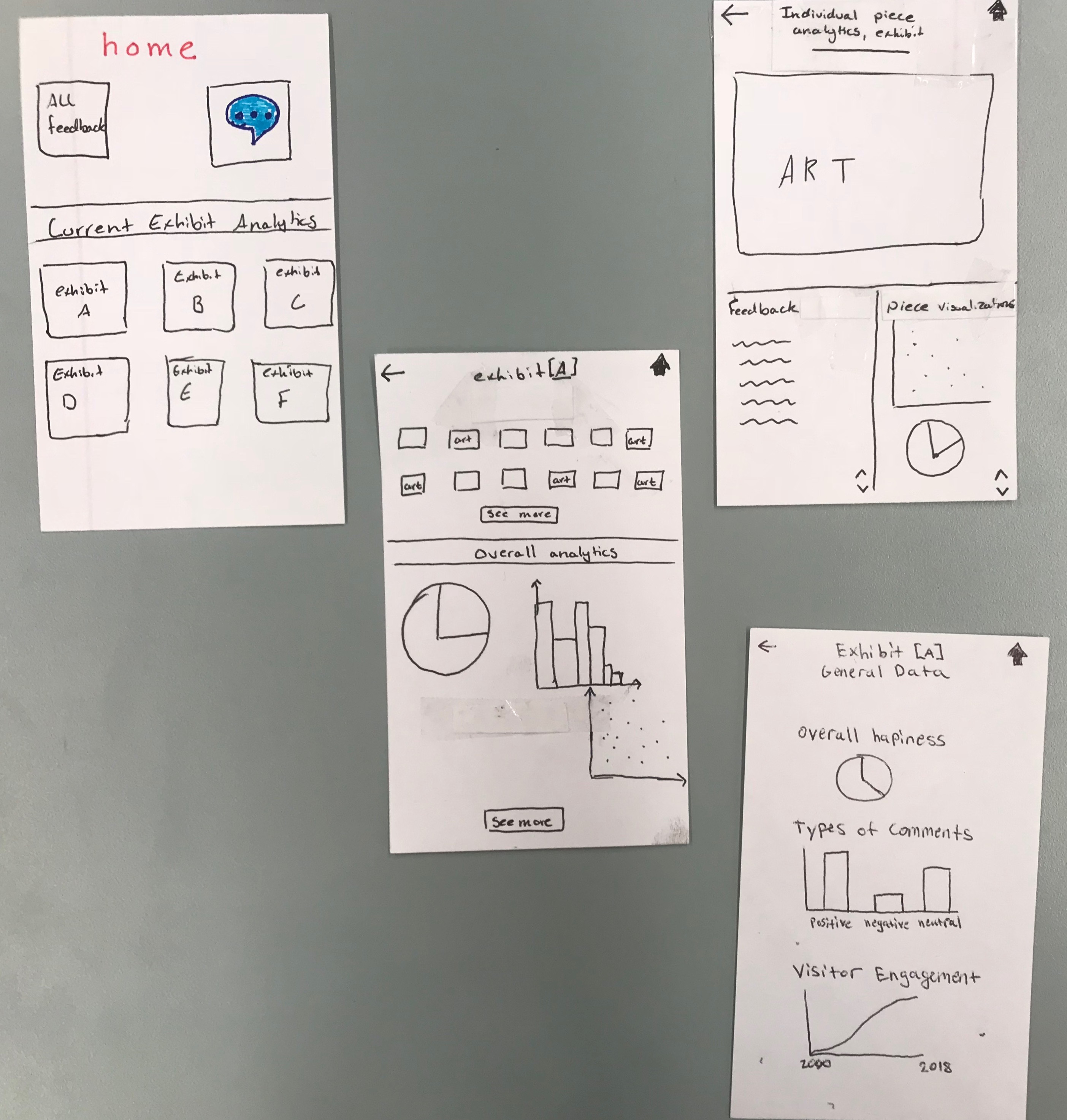 And our website?
We designed our site around the logo colors, which were picked because they looked pretty together. It’s a good thing we’re not being graded on web design, because it is quite inaccessible. I still don’t think we have added alt text, our text colors are unreadable to anyone with color-blindness, and the organization of headers and text is a nightmare for anyone with reading disabilities.
And our website?
We designed our site around the logo colors, which were picked because they looked pretty together. It’s a good thing we’re not being graded on web design, because it is quite inaccessible. I still don’t think we have added alt text, our text colors are unreadable to anyone with color-blindness, and the organization of headers and text is a nightmare for anyone with reading disabilities.
Our website aside, understanding the different way users interacted with our prototype showed us just how many assumptions we had been making about the ways users navigated our app.And many testers didn’t know what to do with the visualiation mock-ups on our paper prototype. Or most of our paper prototype, really. This was embarrassing. If information isn’t accessible, it might as well not exist. I’ve spent time working on accessibility and equitability in tech, and yet had discarded all of that in favor of a design that made sense to me. I still wish we had taken this as an opportunity to do a deep dive on data representation. Our entire project easily could have focused on the way people access and understand information. I regret not speaking up for that approach, because I think that understanding how people interact with data could have made me a better designer, writer, and communicator.
We != Users
Not only did I have to recenter accessibility as a priority, I also had to constantly remember that I am not the end user. I had to recenter my focus on the user, whether that was through refering to interviews and contextual inquiries, or bringing specific questions to usability reviews. This process was both new and familiar: in UX, having a user be involved at every stage of the design process is called participatory design. Previously, I had encountered this idea when writing an ethnography on female queerness in Kuwait, last spring. For the social scientists in the room, participatory design is similar to Patricia Hill-Collins’ Black Feminist Thought.3
In UX, which means having a user be involved at every step of the design process. Our participants were co-researchers and co-designers, not simply testers. The timeframe we were working in proved to create some limitations, however. The design process put parameters around the decisions my team and I made. Once we realized what we were testing for, or the questions to ask, it was time to iterate again. At every step we were pushing forward a half-polished product, guided by feedback that may or may not have been the best to follow. Our contextual inquires were guided by the best questions we knew to ask – and those evolved with each encounter. Because our time and knowledge was limited, we often found ourselves looking back and saying “man, we should have asked this one thing differently, it could have changed everything.” And because we had not established long-standing relationships with curators, the curators didn’t know us well enough to understand what we were trying to say, nor did we know them well enough to always understand them. We found that thinking out loud was an important tool in continually centering the user experience, needs, and wants.4
Focusing on tech might mean missing solutions.
One of the barriers to our application is that it is a new mobile platform for curators. Additionally, museum visitors need to interact with the visitor-facing portion of our technology (the part we didn’t develop) in order to communicate with curators. While we do believe that our application makes data useful for curators, and connects them with visitors, I also realize that there are barriers to use by both curators and visitors. While performing our fourth contextual inquiry, my group and U4 came up with an to use Post-Its on a wall as a way for visitors to interact with art. Interns could document the responses in the same way the WALLS journal was transcribed, and this would allow people to engage with exhibits without needing a smartphone or WCMA-provided device. I know that this isn’t related to our tasks, but it made me wonder what kind of solutions we were missing simply by being so focused on creating for a mobile platform.
Start over. Often. 5
Like I mentioned above, I regret not lobbying to refocus our project entirely on data visualization. I was afraid of starting over, and of sunk costs. I also didn’t know how to communicate the reasons for pursuing data representation to my group. Over the course of our project, however, we made several drastic pivots, and I now understand that design is very similar to research: you adapt based on findings.
Our project began with wanting to make database information more three-dimensional.
Museum databases are flat and one-dimensional. There is no way to quantify the things people feel while looking at, or experiencing, art. This flatness makes it difficult to connect people with artwork based on hard-to-articulate themes (such as feelings)… We have decided to try and use the responses people have to artwork in order to add depth to museum data files. We want to show the “texture and personality” of a collection, and the way exhibits make people feel.
 By the end of our semester, we ended up creating an application, heART, that would visualize visitor feedback and connect curators with visitors who want to ask questions. Our tasks also changed based on feedback from our professor. Since there were multiple other groups focusing on data collection of different forms, we assumed we had all the necessary data and instead focused on creating
a mobile application that will not only organize and present user data in an effective way, but allow curators to understand the experiences of visitors without sacrificing large amounts of time… a design that allows quick access to useful exhibit/artwork analytics as well as an easy way for curators to respond to visitor questions and suggestions.
These two tasks lend themselves well to analysis of data visualizations, and are a drastic change from our initial project proposal. Every iteration required reinventing our design. Where we ended up is where our users needed us to be. We may not be “quantifying the WCMA experience,” but our project still addresses the concerns and needs of curators.
 by landon marchant

You will be able to edit this mural.
So you finished this. Now what?
Honestly, that’s the question I’m asking myself too. When I reached out to a mentor recently for life advice, she said
take every class you can about ethics. tech is going to need it.
So I’m going to spend my last three semesters trying to understand accountability, accessibility, and the role of technology in human lives. Maybe, just maybe, I’ll be able to find that sweet spot between Post-Its on a wall and instantaneous communication via smartphones.
And you?
Well, if you read this and found yourself entertained, or agreeing with my concerns, please do the tech industry - and the world - a favor. Hire a humanities major, or two, or three, or six. Bring conversations about ethics and real-life human consequences into the cost/benefit analysis. Consider who your product favors, and who might need it - but can’t access it. Call it “identifying new markets” if you have to. But most of all, design for the users who are trusting your product.
And one last thing. If you still find yourself intrigued, I’d strongly recommend hiring a sociology major who’s taken a little bit of computer science.
Footnotes:
- Usability Tester 2, though this particular quote is not in our final write-up
- For a conversation of the ethics around representation and classification, feel free to send me an email. Or, until 12/21/2018, swing by WCMA’s The Field is the World exhibit.
- In understanding the experiences of our users, I needed to remember that concrete experiences create meaning for individuals and communities; it’s important to maintain dialogue between co-researchers in order to constantly assess the accuracy of our representations, interpretations, and iterations; community member engagement is key to ensuring each iteration is done with the end user (our co-researcher), in mind; knower adequacy depended on my team’s collective perspectives and experiences, as well as our understanding of our privilege as designers.
- Refining my ability to look back and identify opportunities for change is an extremely valuable takeaway.
- Case in point, I’ve rewritten and edited this section five times so far.