Designing
Curators not only have limited feedback on visitor emotions, but even if they had a surplus of information, there would be no time in a curator’s busy schedule to sort through it. There’s currently no good way for a curator to know whether exhibits (and specific pieces of art) cause confusion or spark inspiration in the visitors who experience them. Furthermore, curators have noticed that, due to their busy schedules, there’s a lack of connection between themselves and the museum visitors.
Since there are multiple other groups focusing on data collection, we decided to pivot our project and assume that we have all the necessary data for this project (i.e. feedback about exhibits and artwork from museum visitors). Our vision is to create an application that will organize and present user data, and effectively communicate this information to curators (with little effort on their part). We want to allow curators to understand the experiences of visitors without sacrificing large amounts of time to personally connect with them. Furthermore, we want to repurpose some of those data visualizations. We think it would be cool to have an interactive wall panel of anonymized data for visitors to play with, increasing audience engagement and possibly giving a means for visitors to communicate more directly with curators (e.g. there could be an “ask the experts” field where visitors can post questions for curators to answer). Our focus has changed over time, but our original project proposal can be found here.
We used a blend of contexual inquiries and interviews to understand our participants, and all engagements were conducted at WCMA. We focused on three primary groups (general descriptions of those groups and their backgrounds can be found here), but conducted 4 interviews. U1 and U2 were both WCMA curators and the interviews were done in their respective offices. Moreover, U3 and U4 were both Williams students, but U3 was an art enthusiast while U4 was a past summer intern at WCMA. It’s also interesting to note that U3 wanted to start in a side gallery before going to the Object Lab, while U4 went directly to the Object Lab. The full writeup for each encounter can be found here. We tried to do contextual inqueries of our participants when we could; however, this was not always an option (mostly due to time restrictions). We felt that contextual inqueries gave us the most insightful feedback since this gave us a better understanding of their perspectives, but interviews with probing questions also gave us some very useful information to work with. Regardless, from these interviews, we developed a better understanding of both visitor and curator desires for the museum. In particular, the Williams students seemed to want a deeper experience where they can work to understand the art, and possibly even discuss it with others. Curators, on the other hand, want to get better and more direct feedback from the visitors. This is especially useful if they can get a sense of what frustrates people, and which galleries people are most interested in.
We had found that some of our high level themes were space (WCMA, exhibits, relatedness) as an experience, criteria for exhibits, feedback and engagement, and introspection. Visitors had expressed a desire to understand, relate to, and engage with exhibits, but without having answers handed to them. Meanwhile, curators wanted to create exhibits for people to critically engage with, wanted immediate feedback on exhibits, and wanted to give context.
We identified themes by looking for common statements, concerns, and questions between our participants, as well as their differences. The curators and visitors had opposing responses despite shared priorities. However, all of them – and the disconnect between responses – point to an issue of curator/visitor communication.
Over the period since we first analyzed our themes, we noticed that data communication/orgaization emerged as the most important theme and audience engagement remained an essential aspect we still wanted to consider. Therefore, to simplify our project, we are assuming that the data we need has already been collected. However, we determined that the effective communication of data to curators would be our primary goal and using that data to engage audiences would be the secondary goal (needed to prioritize in order to avoid the problem of being all things to all people). Therefore, we envision an app that organizes and communicates data to curators (e.g. maybe has a mix of visitor comments, number of people visiting exhibit, number of people who liked a certain artwork, etc.). Then, since the visualization and data work has already happened, we intend to repurpose it in order to engage visitors (and possibly create a more direct connection between visitors and curators). We are considering the merits of an interactive wall panel that displays select data, and allows visitors to interact with it in some way or another (e.g. touch a pink bubble that splinters into different pieces of information about certain exhibits). Information on our original themes and ideas can be found here.
We intend the majority of this design to be used by curators, but we plan on repurposing some of the work in order to engage with museum visitors (recent decision). The goal of our design is to both organize data/feedback in a concise way (mostly through completing task 3) and then effectively communicate that information to curators (task 5). Our original list of tasks can be found here. However, we also recently decided that encouraging audience engagement should be another task we want to pursue. Our tasks allow curators to view and respond to feedback from visitors based on date/time, theme, or exhibit in question. They also will allow visitors to engage with select portions of this data in an interactive exhibit, modeled after the data visualizations curators have access to. Hopefully, our tasks will help curators develop exhibits based on understanding visitor experiences, and increase visitor willingness to give feedback. The ability to perform curation tasks is developed through formal education, personal style development, and mentorship, and assisted by the presence of interns, professional peers, and the museum database. Our design will allow curators to deepen their skills and work more effectively as they go through the WCMA archives. Curators need access to precise, yet diverse, data. They need visitor experience, quantified. Right now they have a gap in data because many people don’t take the WCMA experience surveys or exit interviews. We are assuming this data has been provided – it is now our responsibility to help make sense of it. Curators are currently designing new exhibits 2-3 times a year, so we are focusing on the real-time reporting of data to curators, with features that allow them to examine feedback over different timespans. If things go wrong, curators will be making decisions based on faulty information since our design is focused on data organization and visualization. Our original task analysis can be found here.
1. collect pre-existing data from WALLS journals
2. collect exhibit thoughts and feedback from representative groups of visitors
3. assign collected visitor data to specific artwork in database
4. search database to curate exhibits
5. summarize and communicate visitor feedback to curators
6. establish a direct connection between curators and visitors (i.e. where visitors can ask clarifying questions)
All of our designs implement three new tasks, and combine existing tasks to do so. Our three new tasks are
design 1: “Organization and Communication” –> Design one combines tasks 2, 3, 5, 6.
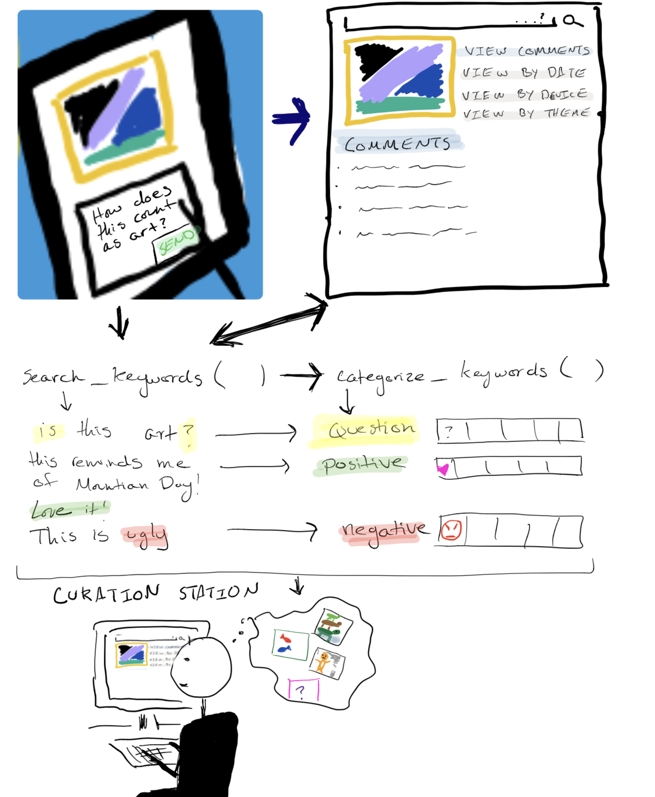
general idea: We see a mobile interface - either through an app or device - as a way to collect feedback from visitors (task 2). This feedback will be saved to the database for each specific piece they comment on (task 3). Some computer algorithm would search for certain keywords in each of the comments. It would then categorize these comments based on positive/negative feedback, whether or not the feedback is a question, etc. (task 5). This information could then we relayed to curators, supporting a more direct information stream between visitor and curator (task 6).
design 2: “Presentation and Interaction” –> Design two combines tasks 3, 4, 5, 6
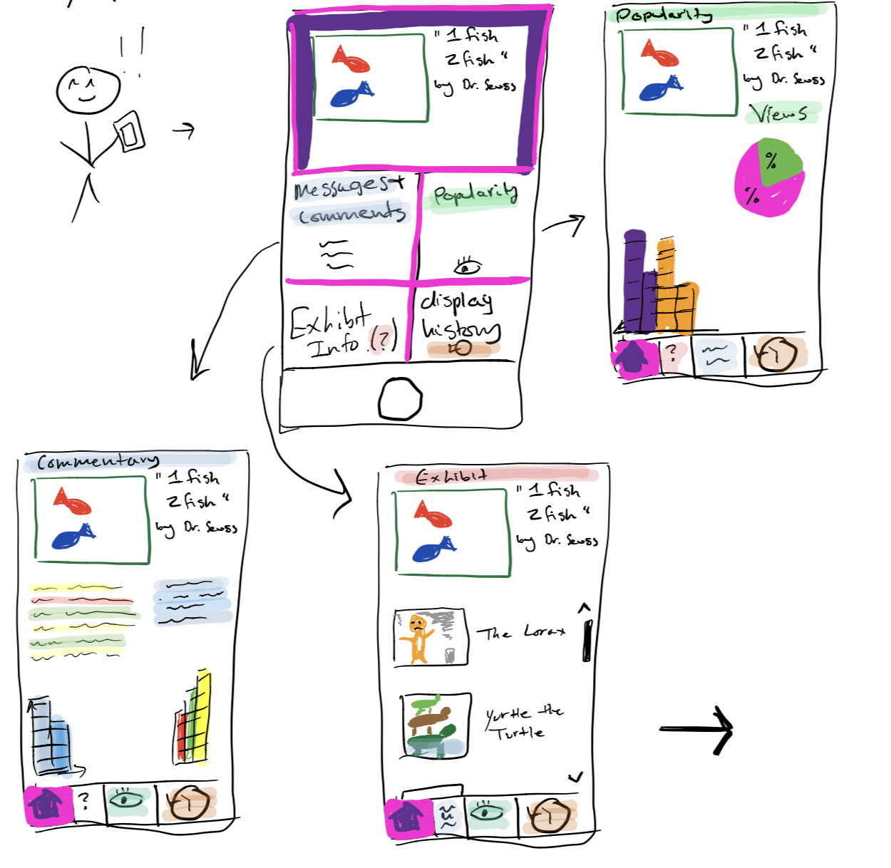
general idea: Assuming we have all the data we need, the task becomes creating an application that will summarize and present data (task 5), allowing curators to search it (task 4). Our application’s interface would show how many people looked at a certain piece, how many people commented on it, the exhibit it’s currently in (or was last in), and the history of the piece. Grouping information by exhibit makes it easy for curators to know which exhibits - and pieces - provoke certain responses (task 3). Through an interactive wall panel, we may also be able to engage visitors with this data as well, and possibly giving them a more direct connection with curators (task 6). Even though we will have to make sure we don’t spread our design too thin, we may be able to create a project that appeals to multiple groups of users (i.e. both curators and visitors) by repurposing data and designs.
design 3: “Testing Exhibits” –> Design three combines tasks 2, 3, 4, 5
general idea: Allow curators to virtually test exhibits. Instead of having exhibits where visitors provide feedback, curators will create a virtual temporary exhibit that visitors can explore on the app. Similarly to how the museum has promotions for temporary exhibits, they can do something to try to promote the exploration of these virtual exhibits. Even though it might be difficult to get a representative sample of visitors, this will allow much faster feedback (task 2). Additionally, since the feedback will already be submitted electronically, summarizing it will be a lot easier (can do the same thing where you tag certain keywords in the feedback — task 5), and the data will already be assigned to each piece of artwork (task 3). Finally, this will make it easier for curators to curate exhibits (task 4) since they can test things more easily and see how they work. This is mostly based on our data that curators have to go through a lot of trouble with temporary exhibits, mostly with intent of collecting feedback. With this virtual exhibit, it will be much easier and cost effective to try out newer and more esoteric pieces.
We decided to pursue our second design (creating an application that summarizes and presents data) with a focus on tasks #3 (assigning data to specific pieces of art) and #5 (efficiently summarizing and communicating visitor feedback). First, based on Glow feedback, there appears to be multiple other groups that are focused on data collection. Since our second design assumes we have all of the data we need, it will probably be more fun and rewarding to work on something that is different from the other groups. Moreover, this is the design that most directly completes our goal of assisting curators, while also giving us room to expand our intended user base. After our contextual inquiries, we had decided that it was too difficult to try to make an app that pleased everyone. Instead, we wanted to focus on assisting curators. Even though all of our designs portray curators as the primary users, only design 2 emphasizes the aspect of improving communication of data, rather than the further collection of data. Currently, since curators already have large amounts of information, it makes more sense that the organization of this information would be the most efficient way of helping them. Since it is evident that data organization is our focus, it follows that task 5 would be one of the most crucial pieces of our process. Furthermore, our decision to focus on task 3 stems from the feedback we received in the Design Check-In. In particular, it was recommended that we not only communicate data to curators, but also “the general public to get people initially engaged with the content.” Since we decided to pursue data organization, it follows that task 3 would be the most appropriate for our design. In particular, assigning visitor feedback to specific pieces of artwork (task 3) will assist us in completing task 5 (organization), while also giving us the flexibility to provide audience engagement. For example, if visitor feedback is specified to a certain piece of art, this could promote discussion if visitors are allowed to respond to each other via the interface (increasing audience engagement). Additionally, task 6 would have been the only other task that was even remotely related to audience engagement (everything else focuses on data collection and searching). However, since task 6 wouldn’t directly utilize our data organization improvements from task 5, this would make it harder for our project to focus on both of the previously mentioned tasks. If anything, task 6 would be a possible extension for our design if we had extra time to complete it.
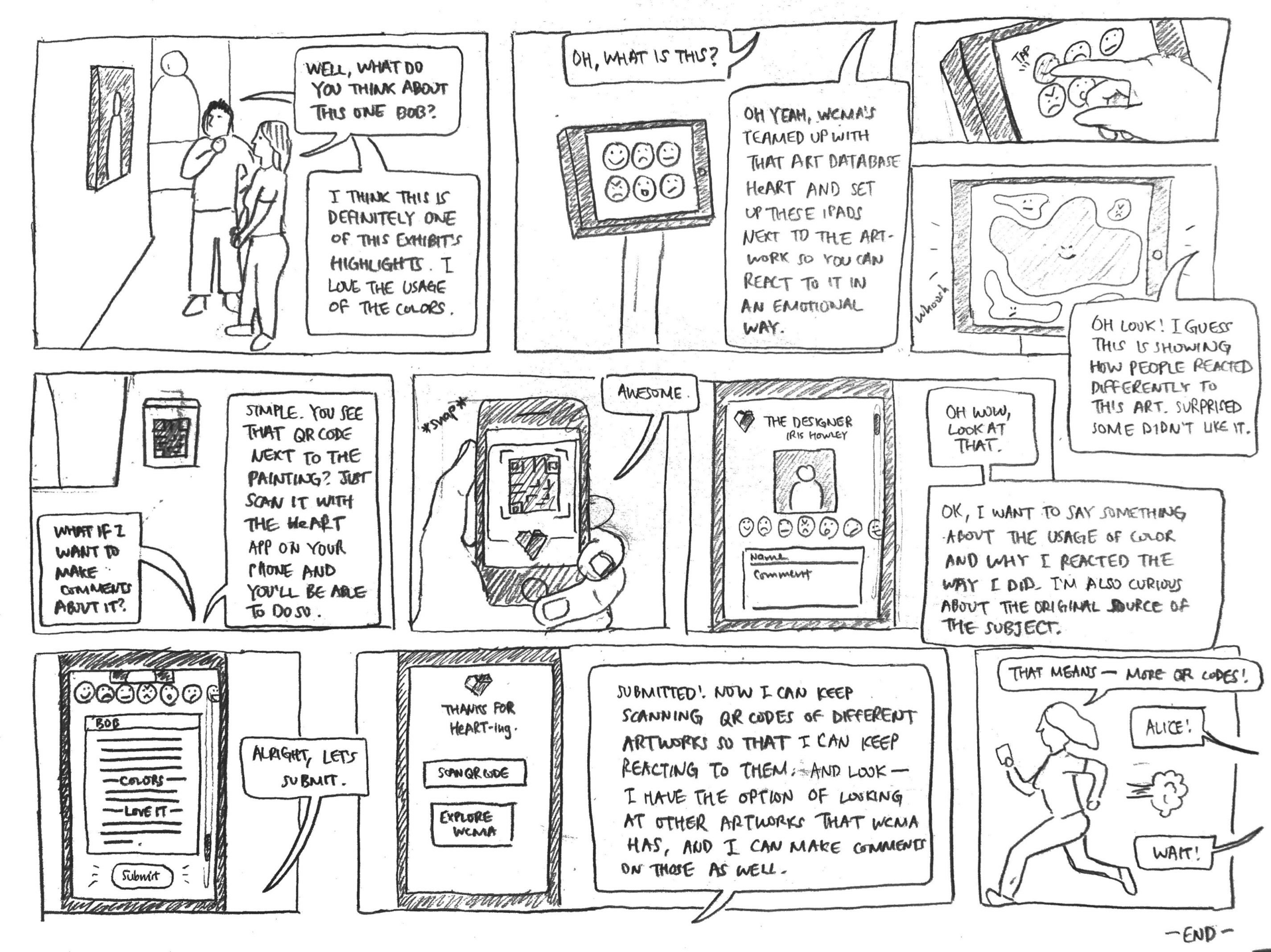
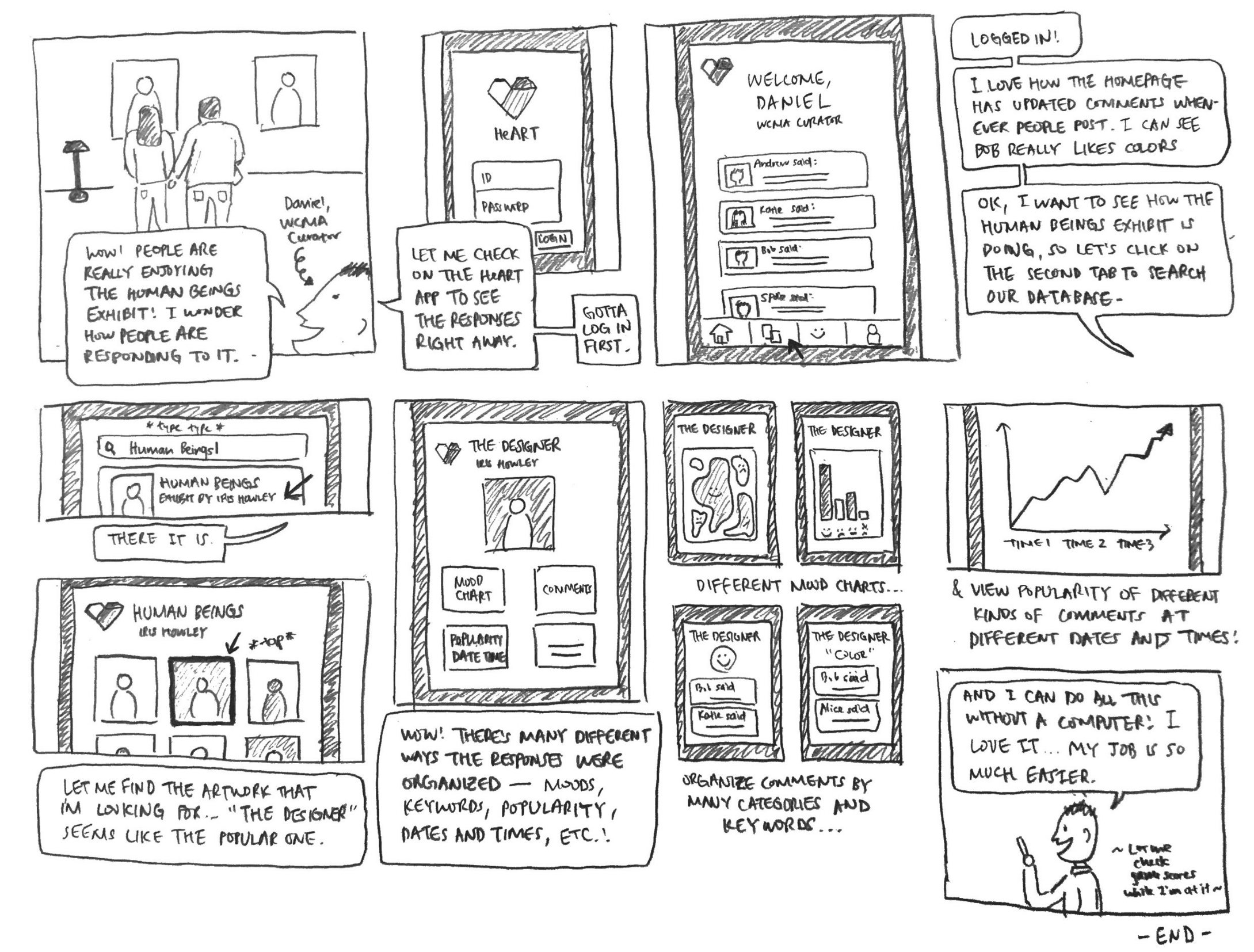
References to storyboards are in the sequence (Storyboard #, Frame #)
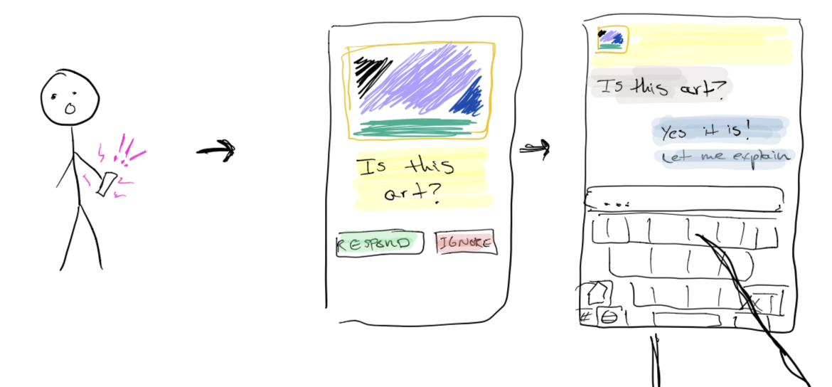
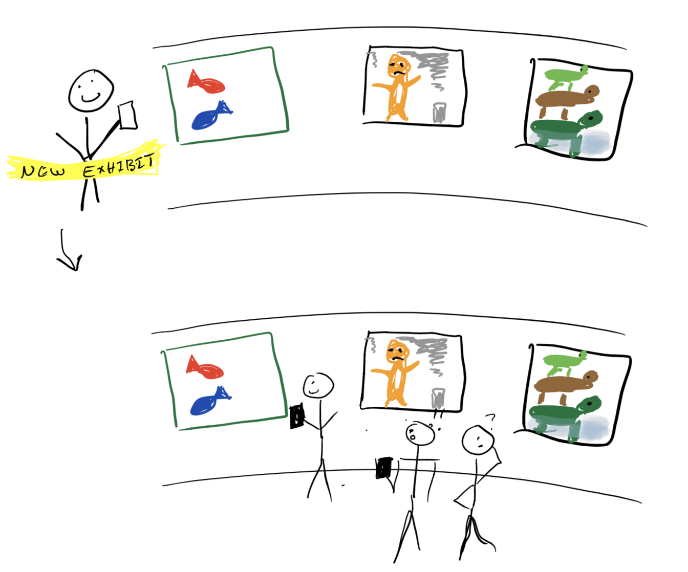
Bob and Alice are visiting WCMA while waiting for their friends. While talking about the meaning of a piece of art (S1, F1), Bob sees an iPad and QR code next to the installation. Ari explains that the art database heART has teamed up with WCMA to help visualize the responses people have to artwork (S1, F2). Bob plays with the iPad and sees there is an interactive visualization component that shows what people thought of the displays (S1, F3, 4). He decides to scan the QR code and leave a response so that his opinions about the artwork could be added to the cool color bubbles (S1, F5-9). Alice races to beat Bob to the next QR code (S1, F10).
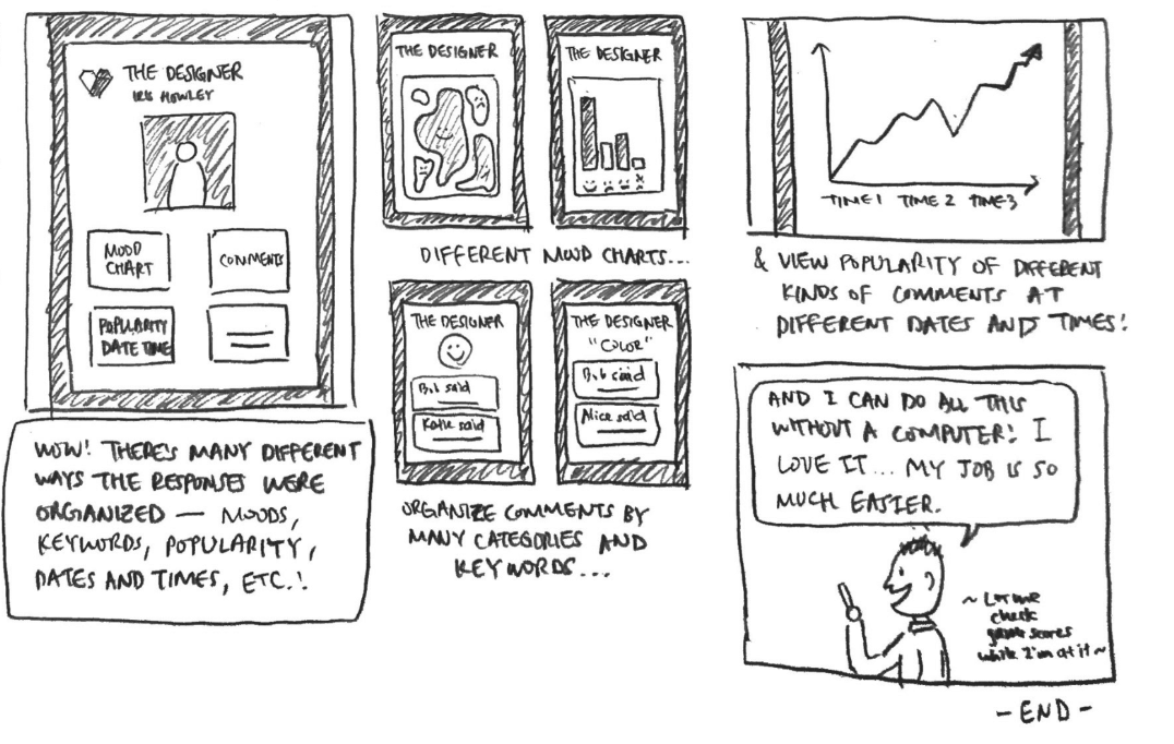
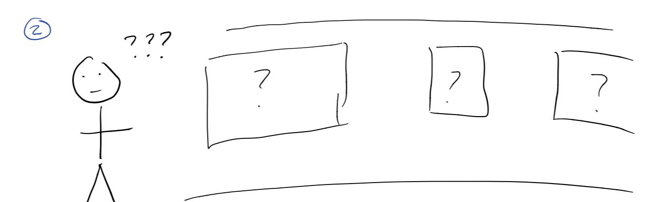
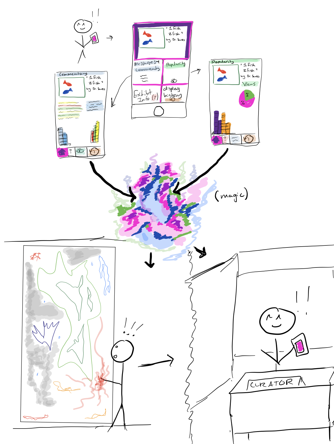
Daniel sees people visiting the WCMA Human Beings exhibit. He wonders how people are responding to it, and decides to check his heART app (S2, F1, 2). After logging in, he’s brought to a home screen that lets him sort visitor feedback based on moods, keyword, populatiry, dates and times, and more (S2, F3). Daniel is able to view visitor feedback in a variety of different ways, all of which update in real time. One of them is an artistic, abstract, visualization, identical to the one visitors can play with near the WCMA entrance (S2, F7). The others are more traditional graphs and text (S2, F8-11).
We included data collection in our storyboards in order to help readers understand how our design would function. Our design focuses on the organization and presentation of data, not the collection. Given that, the most important frame from Storyboard 1 is Frame 4, and the most important frames from Storyboard 2 are Frames 7-11. These make no sense if presented without an explanation of the data we are using, however, which that has influenced the design of our storyboards.