Usability Tests
Usability Test 1
Our first usability test was with a student. UT1 is an econ major who has only been to WCMA once, but asks a lot of questions about the way things work. UT1 is a good friend of Malibu’s so she didn’t attend this test. We met at Lee’s because UT1 was finishing up dinner and had a short window of time in which to do the test. Each team member introduced themselves, and explained their roles. Landon introduced the project and took notes while Chris was the computer and performed the majority of in-test communication. Kenneth was going to take notes but had to leave unexpectedly. UT1 knows one of our classmates, so we found out mid-introduction that they had already heard about the project and assignment. Landon introduced the project as an application that will allow WCMA curators to interact with visitor feedback and exhibit data. He then described the two tasks that UT1 should try to complete: 1) try to find analytics information about specific artwork, 2) try to respond to a message from a museum visitor. We also told UT1 that he should try to voice his thoughts outloud so we could understand areas of confusion, and give us a sense of possible improvements.
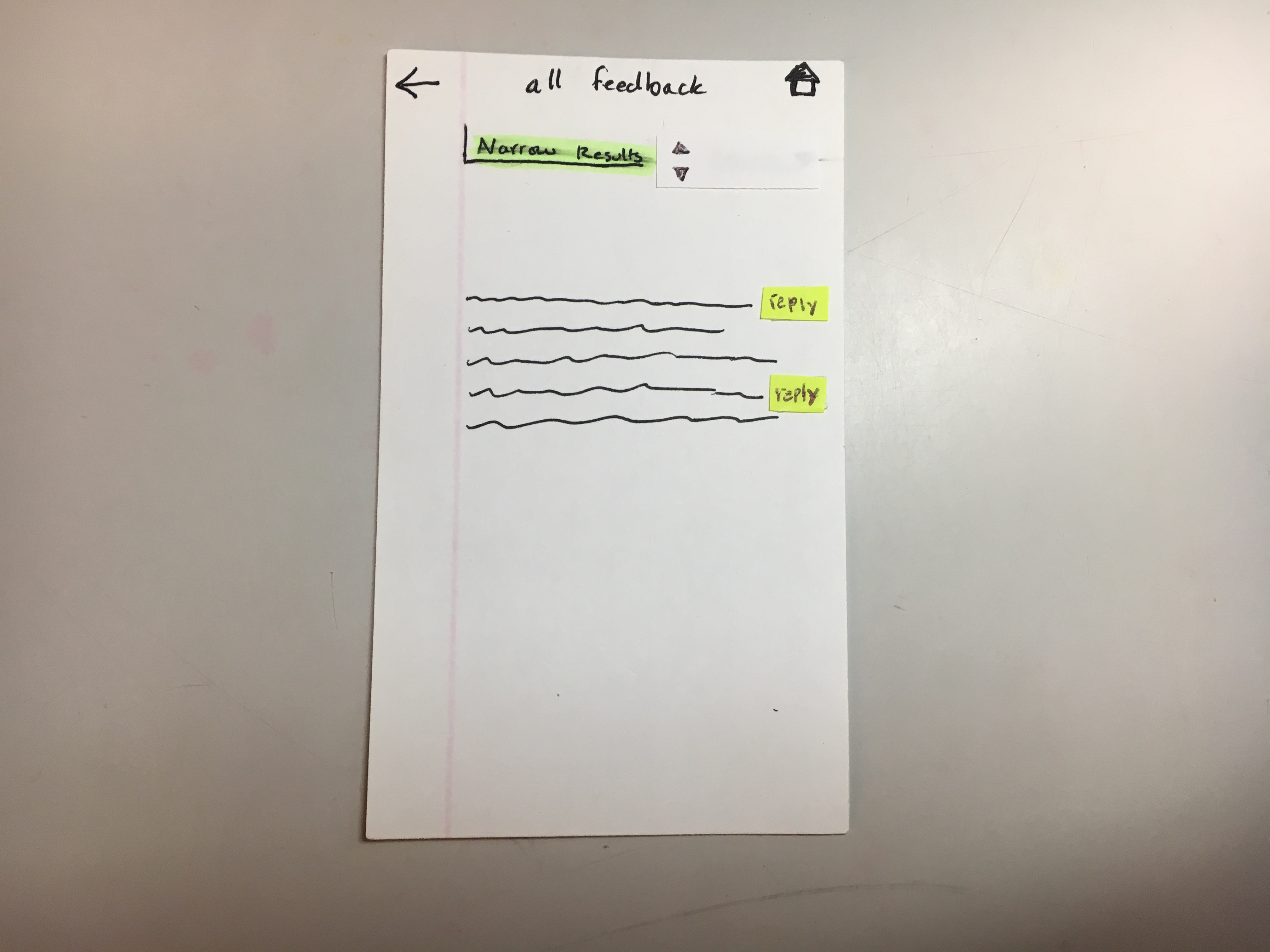
After the test, we realized that our tasks were a little too specific and artifical; however, we still gained some useful insights. He walked through his thought process as he navigated our design and pointed out multiple things that were still unintuitive (at least to him). We were then able to iterate our design (such as editing the “narrow results” drop down in the “all feedback” screen) before moving on to U2 (these revisions are included in the table below).
Usability Test 2
UT2 is an Art History professor who specializes in African art and the relationship of people to spaces. Their office is in the basement of WCMA so the Object Lab is nothing new to UT2. We met in the Object Lab for this walkthrough because we wanted to place UT2 in a space that lent itself to considering people, art, and the classifcation of objects in WCMA’s database. All three of us were able to participate in a conversation with UT2 around thoughts, questions, and ideas they had. Chris was the computer. Landon and Kenneth took notes. As the computer, Chris had more opportunities for question asking, Landon and Kenneth were pretty swamped in note-taking. The project and test was introduced, roles explained, and the importance of thinking aloud was stressed. We explained the concept of simulating an actual application, re-emphasized the importance of thinking aloud, and described our tasks. The tasks we presented UT2 with were 1) find exhibit analytics, then artwork analytics, and 2) communicate with a museum visitor.
However, soon after the introduction, UT2 qucikly began clicking through the interface and asking questions about our data visualizations (e.g. what is the role of your data visualizations in this design?). We decided to answer her questions and let her continue with the usability test in this free pattern (instead of restricting her to our tasks). Even though this became more of a discussion about further functionality that might be useful, we were still able to get some feedback about more intuitive navigation structure (in retrospect, allowing this freedom made it hard for us to focus her on our tasks, so this was probably a mistake).
In our discussion, Chris asked specifically what kind of data UT2 would want access to as a user, what kinds of charts would be useful, and what kind of layouts may be more intuitive. UT2 said that she wants to know if visitors are getting the takeaway that UT2 is intending. This is the information she voiced as most crucial. Chris also specifically asked how we should organize questions, comments, and feedback. UT2 pointed out that questions are different from suggestions which are different from general feedback and event-specific feedback. This supported our idea that we needed to explicitly separate comments, suggestions, and questions so people can have an idea for the type of feedback they should expect. UT2 also had multiple ideas about other functionality that we could add to the design; however, due to time limitations, we decided not to implement these changes (otherwise, it would require additional tests to make sure we implemented them correctly).
We did not make any changes to the paper prototype after UT2 since we wanted to see if UT3, a curator, had similar responses and navigation patterns to UT2. The recommended changes by UT2 are listed below:
- Ability to navigate from data analytics to comments
- Amazon review organizational style in bar chart for feedback, each bar takes you to the corresponding feedback.
- Add help feature to home screen
- Distinguish between things we can reply to and things we can’t
- Allow curators to generate their own graphs based on data, offer different types of visualizations they can work with.
- Consider a notes function
- Ability to store art in a “future exhibits” section so curators can plan in anticipation. Provide tools they need to create initial layouts and collect pieces.
Aside: the recommendations that were actually implemented are shown in the table later on this page.
Additionally, at this point we realized that we had to redefine our tasks. In the first usability test our tasks were too artifical, making the walkthrough very unnatural. However, in the second usability test we didn’t really follow the tasks, making it very hard to stay focused on the feedback we needed. Therefore, we came up with the following tasks: 1) allow curators to get a better understanding of their visitors by providing more information about visitors’ behaviors and feelings towards certain exhibits/artwork, and 2) allow curators to communicate with visitors by giving them the ability to answer questions directly.
Usability Test 3
UT3 was a curator, Chris and Landon met them in what looked like a common/kitchen space in WCMA offices. Chris was the computer, Landon introduced and took notes. They both asked questions. It made sense to meet UT3 in their office area because they were meeting us at the end of their day. The project and test was introduced, roles explained, and the importance of thinking aloud was stressed. We tested with the same prototype we used for UT2, but gave UT3 the tasks that we came up with at the end of UT2’s usability test: 1) allow curators to get a better understanding of their visitors by providing more information about visitors’ behaviors and feelings towards certain exhibits/artwork, and 2) allow curators to communicate with visitors by giving them the ability to answer questions directly. Additionally, when UT3 asked questions or pointed out similar changes they wanted made, we said that those were changes we were planning on doing, could they talk more about it. This allowed us to get very in-depth feedback about a few issues.
UT3 said that curators like pretty visual things, so the less text the better. When asked how information should be organized, UT3 said, “Questions are different from comments. Those are different, so separate questions and suggestions. I would feel compelled to answer questions, suggestions I’d want to tuck away (until I have time to reflect). I’d want to address people’s questions in a more timely way.” Additionally, UT3 wants to see questions people have, because “if people have questions about the art or show itself then I didn’t convey something right.” UT3 also liked the idea of more immediate data, since feedback tends to be delivered to curators monthly. Chris asked what kind of information would be most useful to them as a curator. Would they prefer more subsets in “home” or a more robust sort feature? UT3 said they prefer more categories in the home page, because all feedback seems overwhelming. “Why would I ever want to see that? That wouldn’t be a daily occurrence, that could be buried.” UT3 then asked “can we break it down by time? What’s the stuff that’s most useful to me?” However, we realized this sense of being overwhelmed was due to a lack of specificity in our data. Since we used a bunch of squiggly lines, it became apparent that it was just hard for UT3 to conceptualize what exactly was going on. We talked to UT3 more about how we should divide up the feedback and she said she would like to see it split by exhibition, questions, then suggestions. Finally, we discovered that WCMA as an institution also would want seasonal feedback (so timestamps on data is very important).
Additionally, UT3 seemed to be overwhelmed on the Exibit [A] page. After asking her what information she thought was most important, she said she’d like data on user satisfaction with exhibits, and big takeaways and thoughts about the exhibition. More information on this is shown in the table of revisions below.
Feedback
Note: When we received user feedback, we were not only given information on how to improve our design, but users tended to also communicate new functionalities and completely different ways we could have communicated the data. However, as noted in the UT2 usability test description, implementation of these new ideas would require us to run more usability tests in order to determine whether they were actually more intuitive than our original design. Therefore, we did not implement the following functions from the feedback that was given (and the table only shows revisions we did make):
- Amazon-esque review feedback organization (UT2)
- Allow curators to design their own graphs based on data (UT2)
- Store art in a “future exhibits” collection (UT2)
- Notes function (UT2)
- Data collection that provides context (UT3)
Table (see figures below for pictures of where problem occurs)
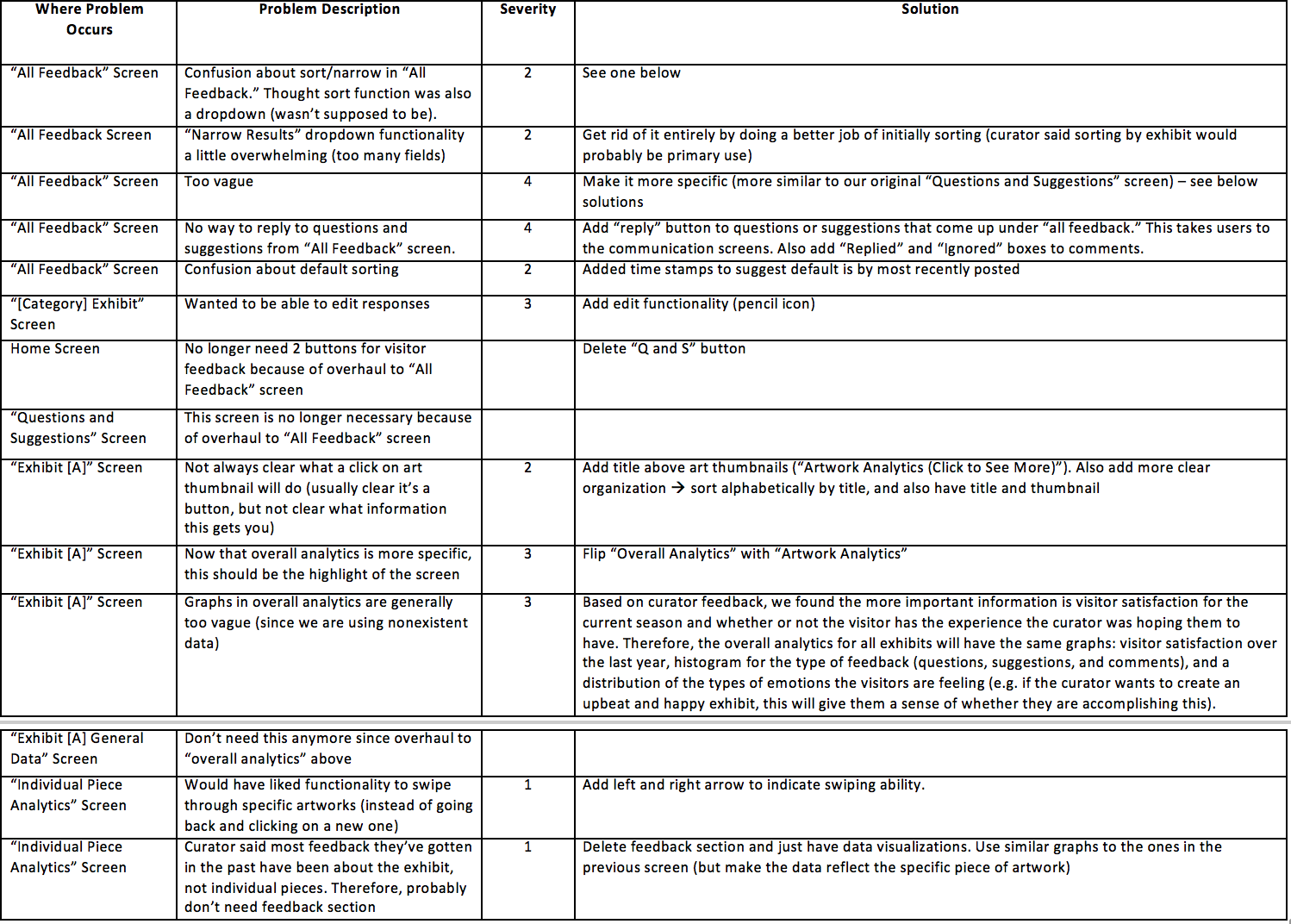
Prototype Changes
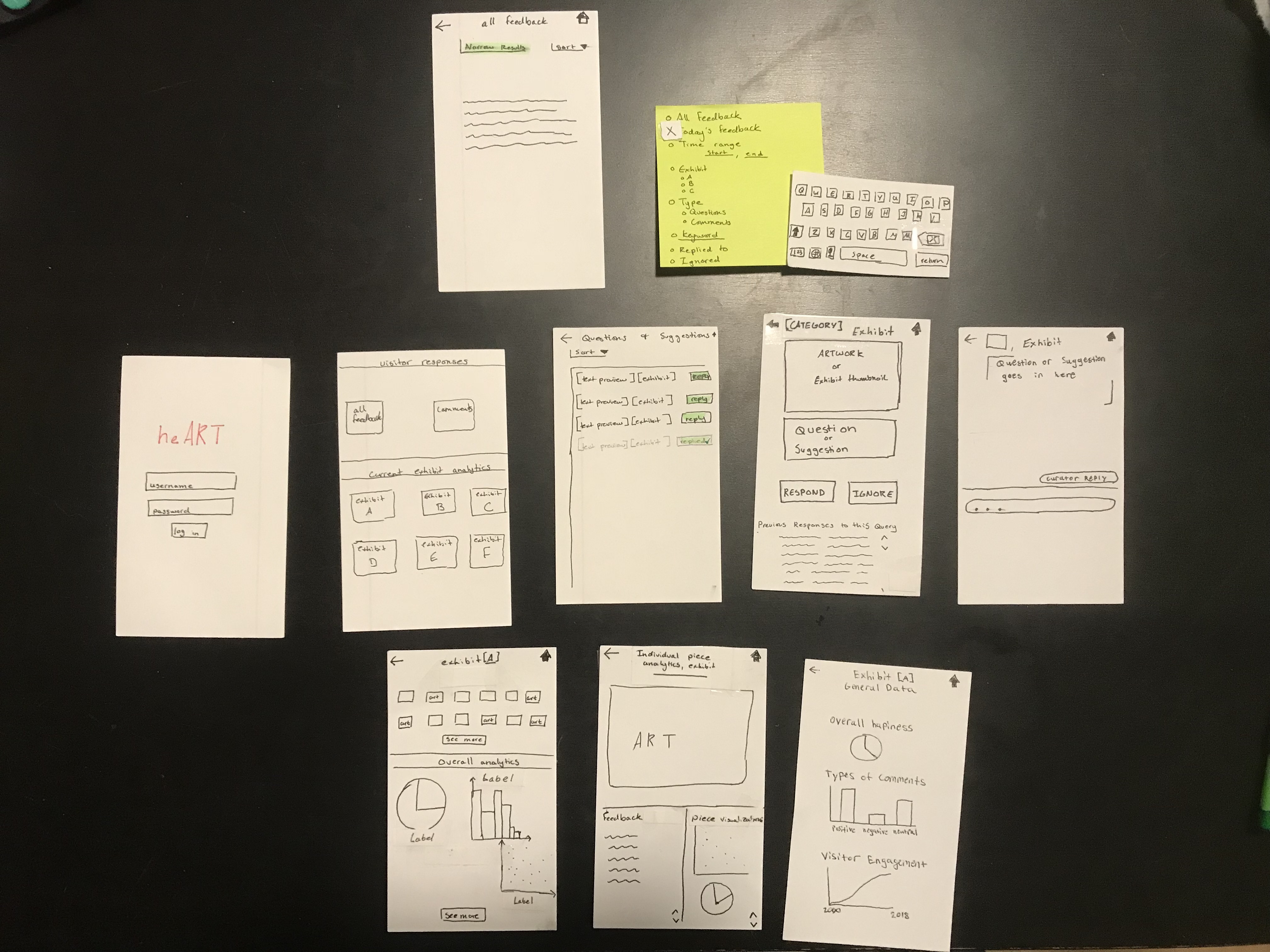
Here’s an overview of our original paper prototype since the heuristic evaluation:
Here’s an overivew of our new paper prototype
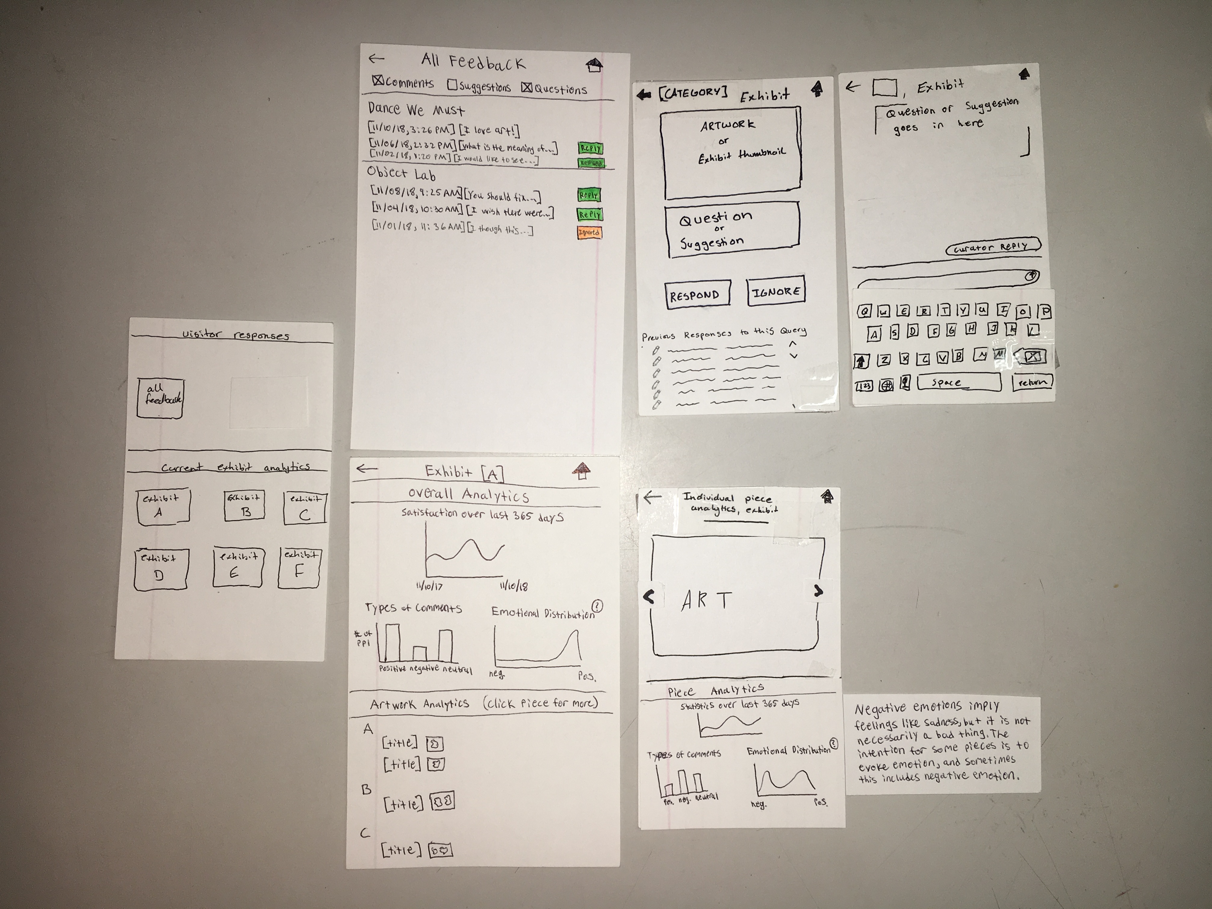
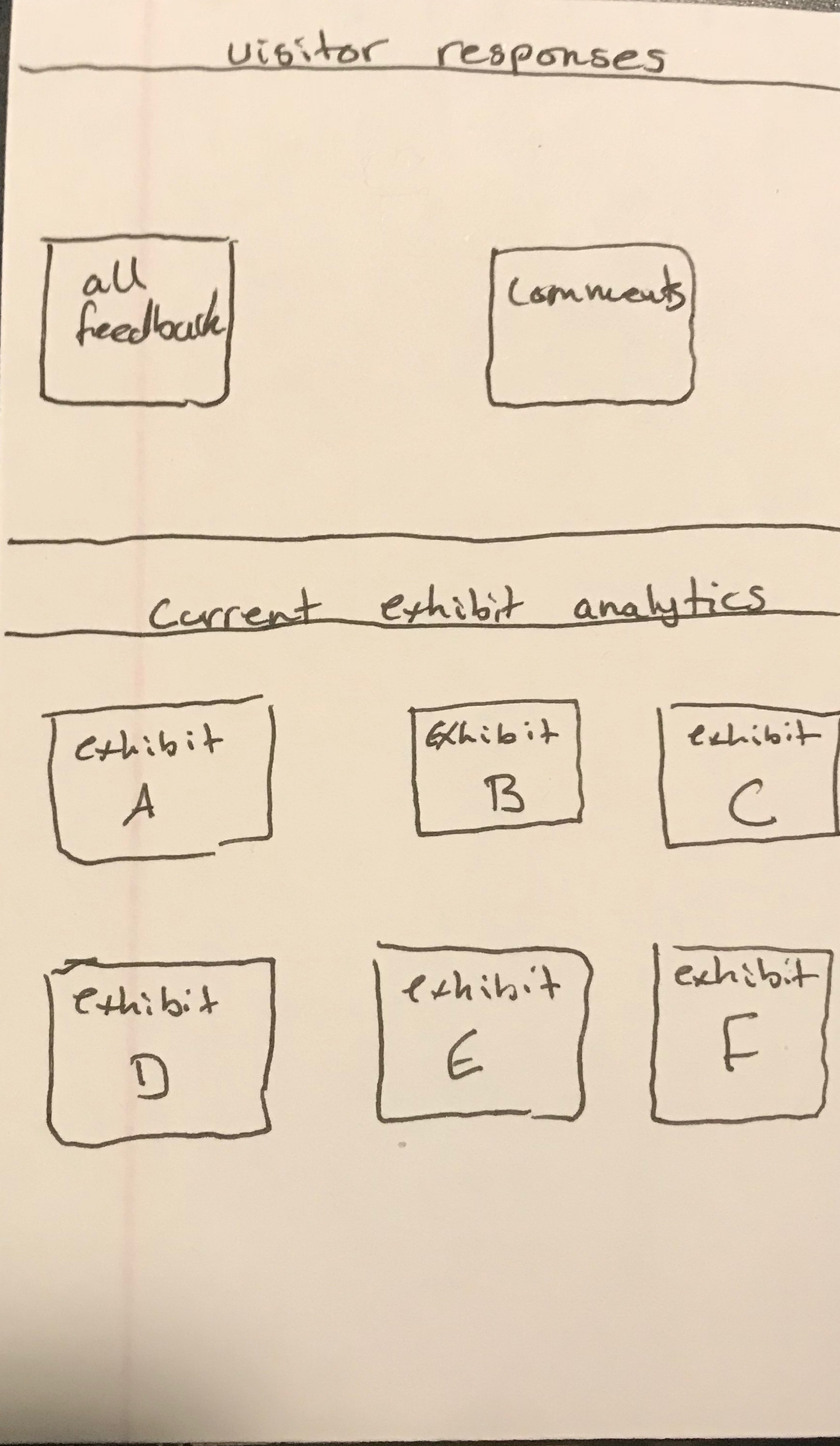
Home Screen (old, new)
“All Feedback” Screen (old, new)
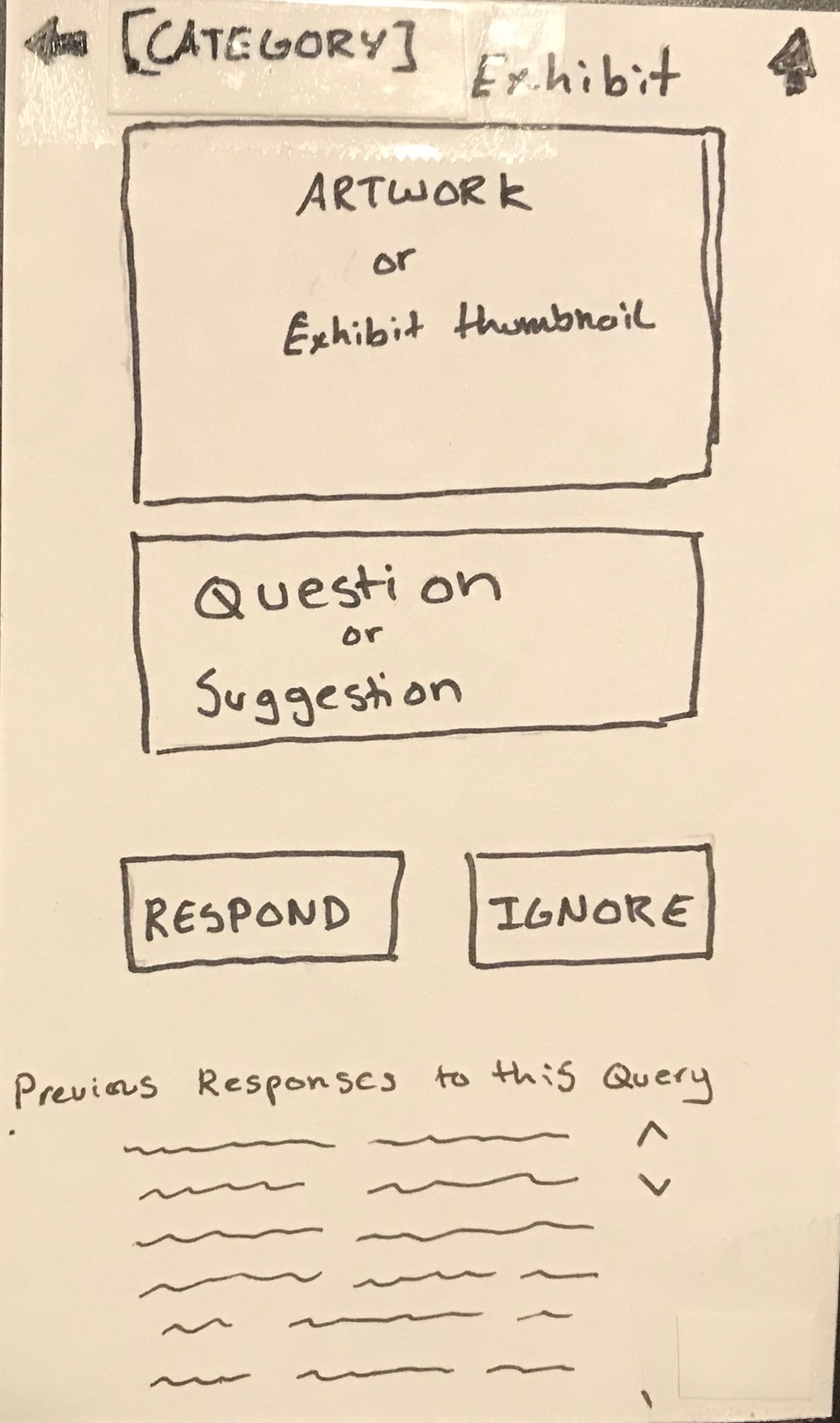
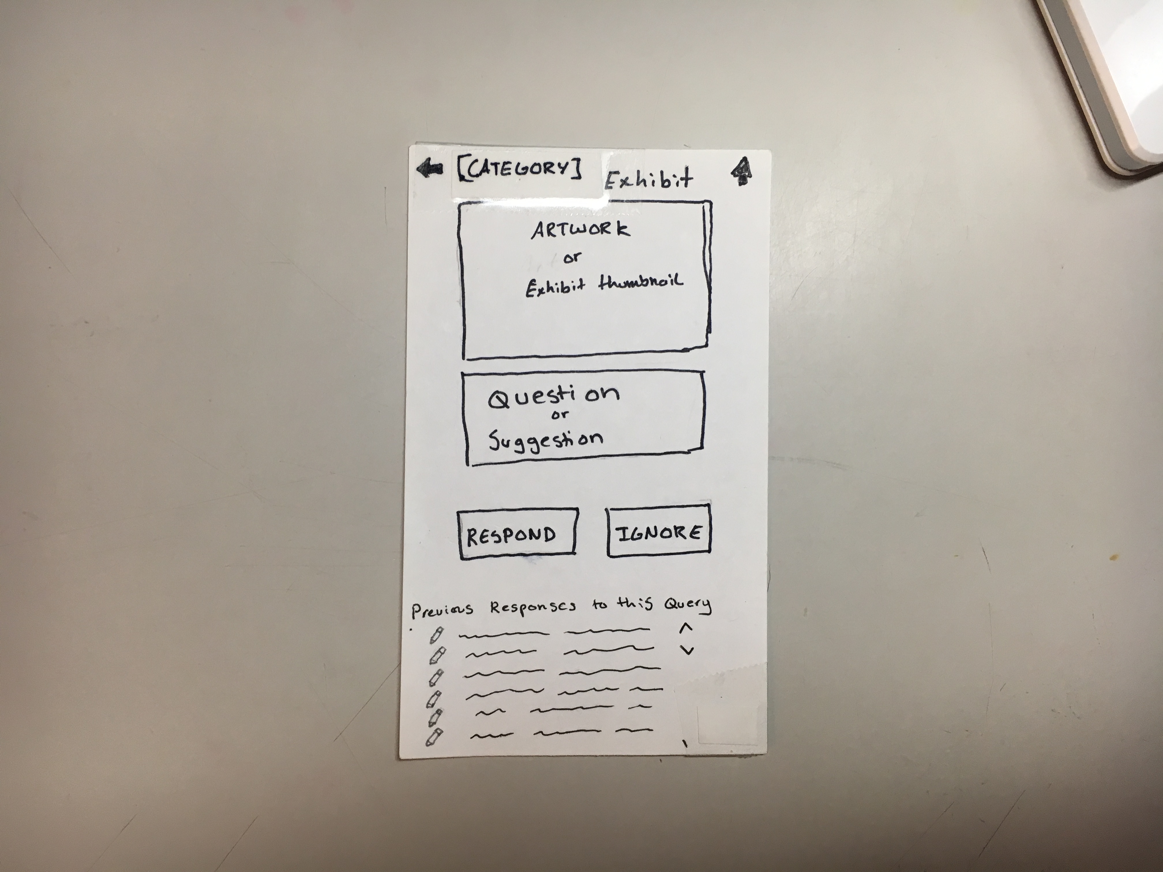
“[Category] Exhibit” Screen (old, new)
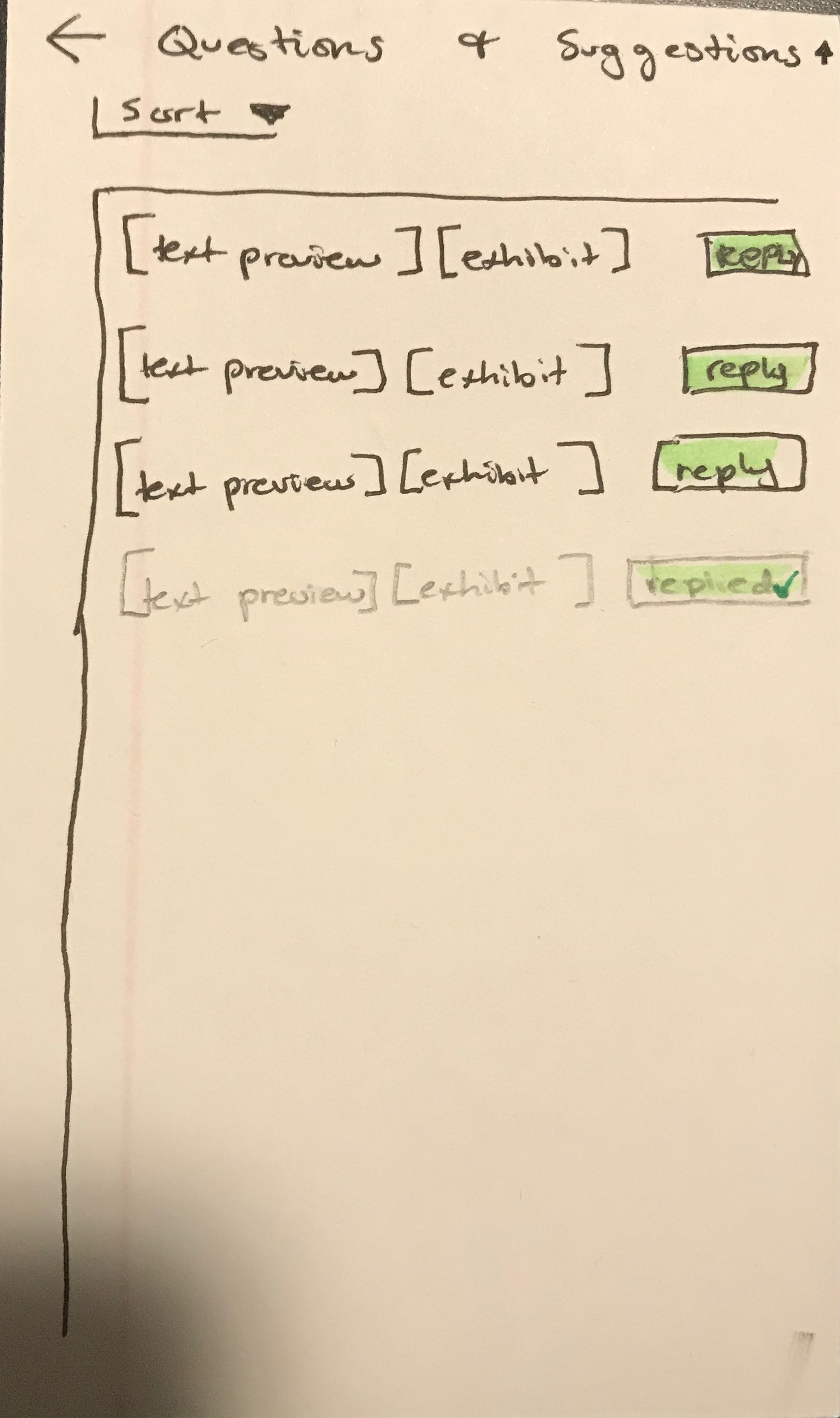
“Questions and Suggestions” Screen (DELETED)
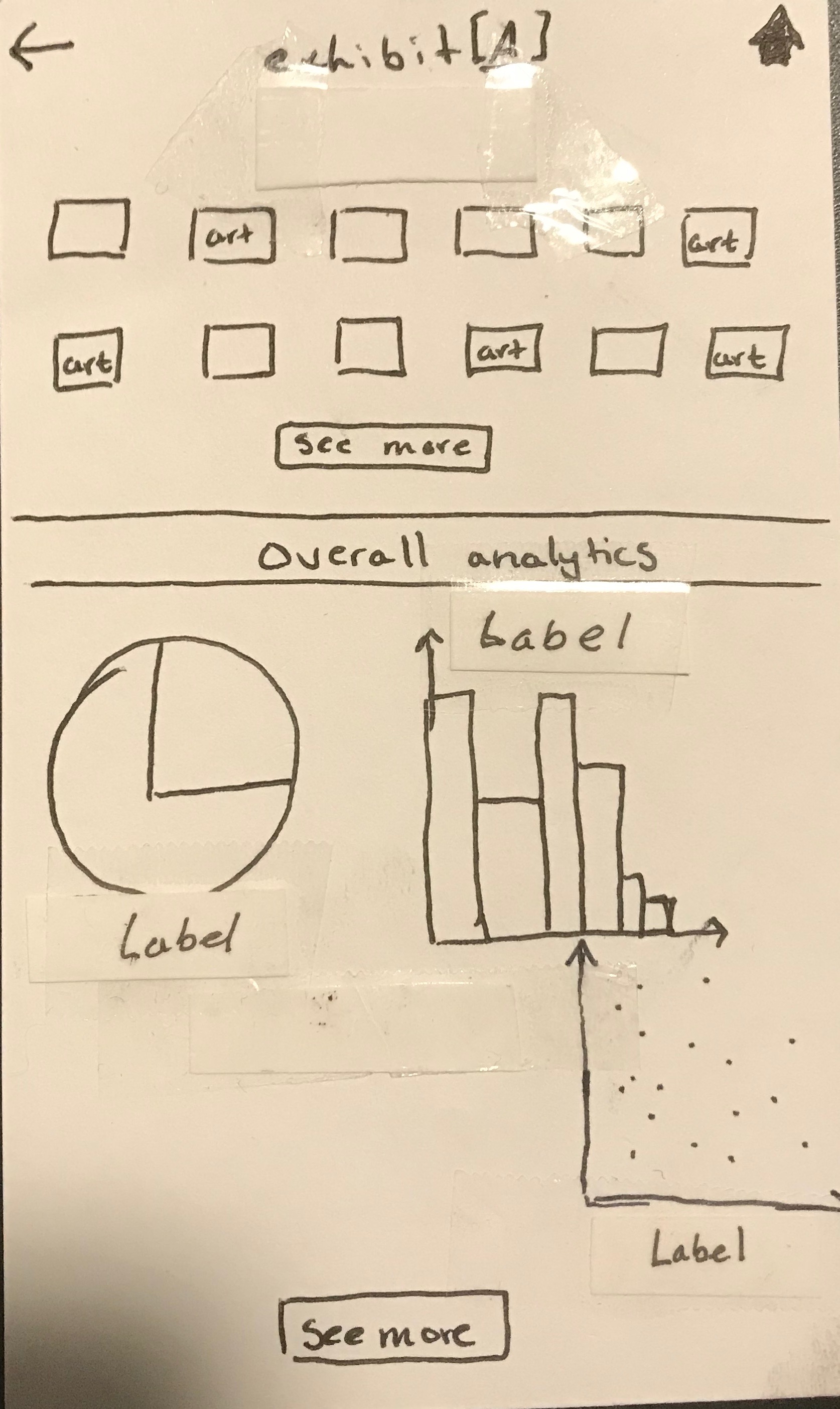
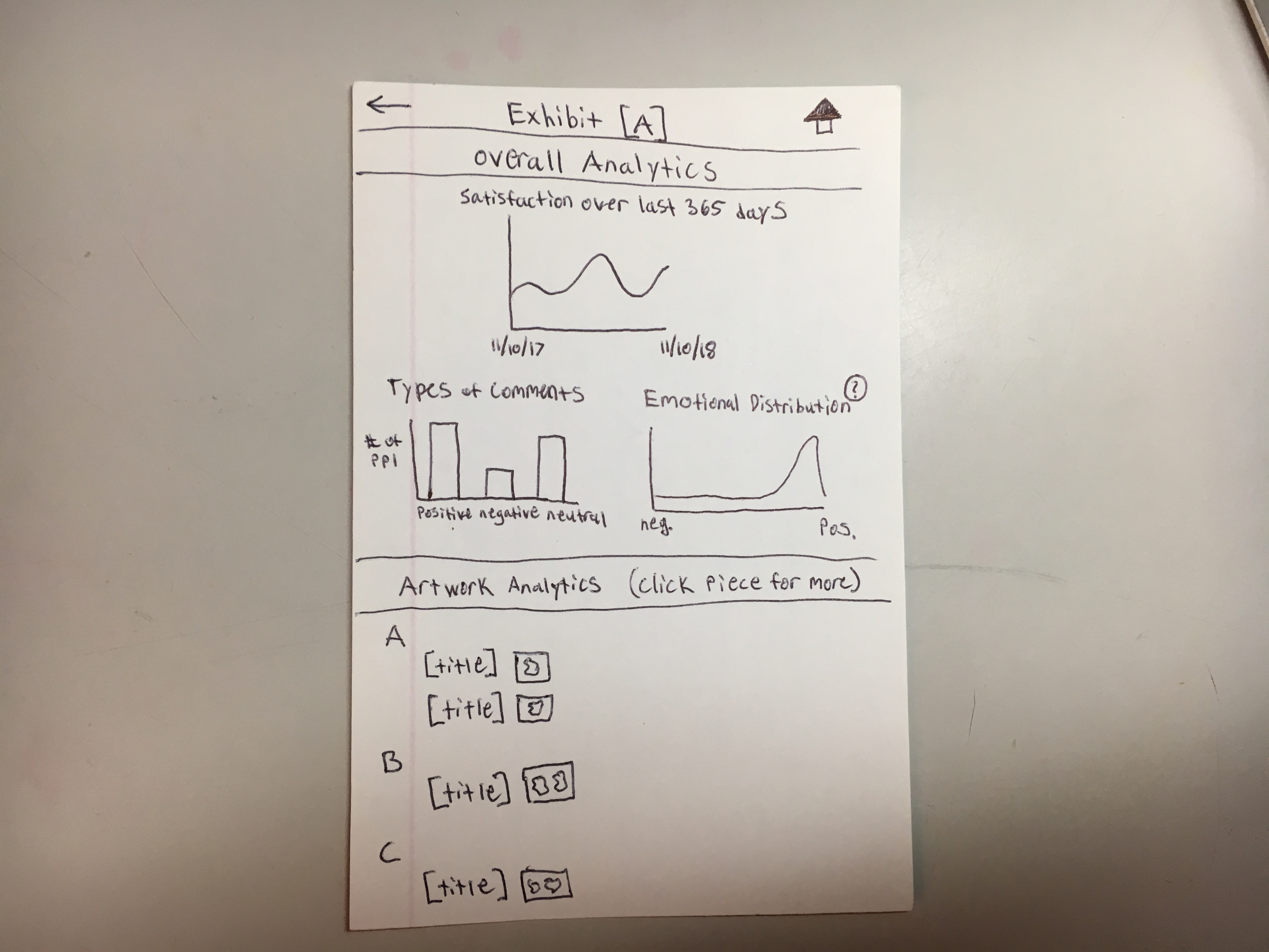
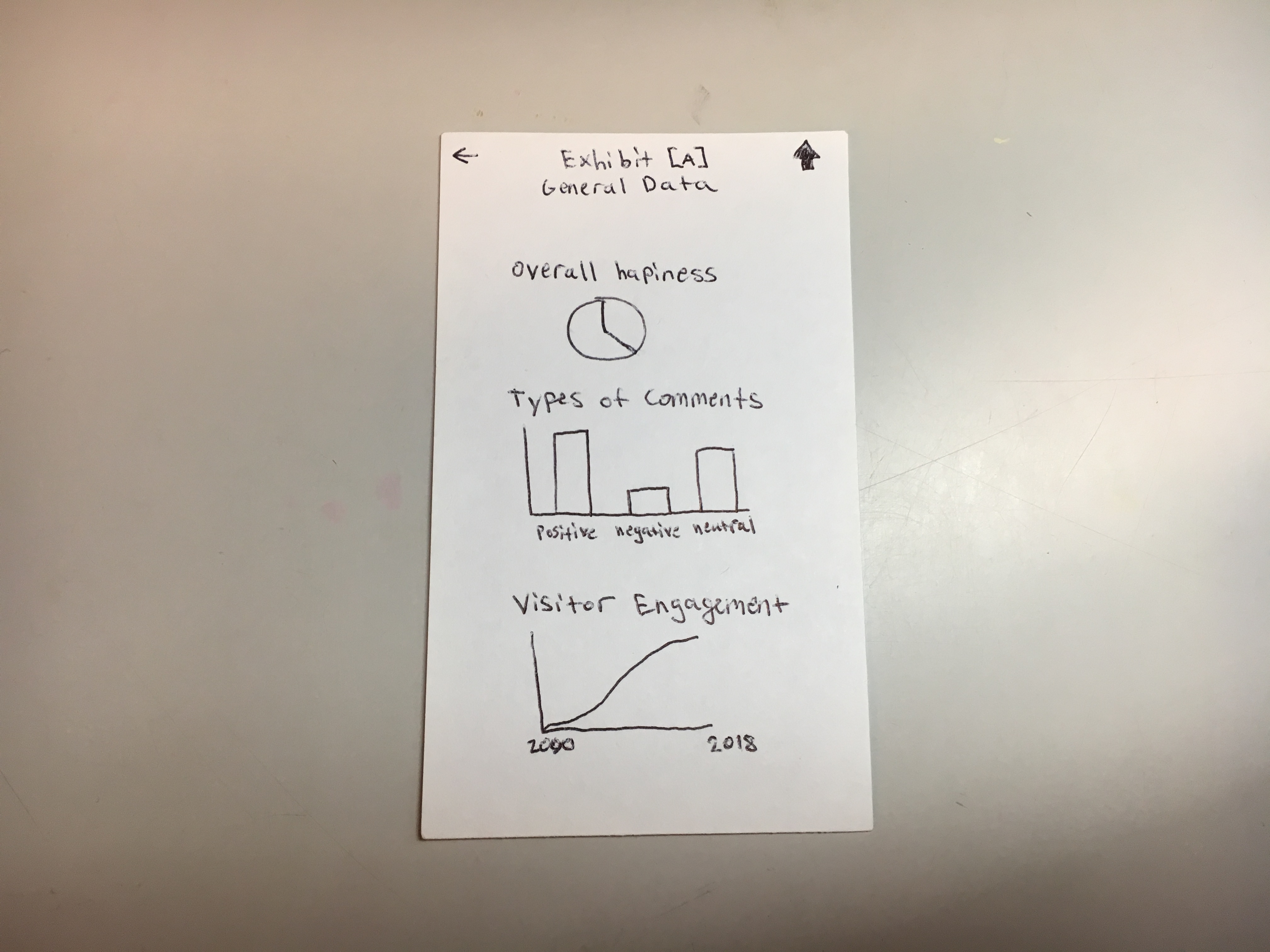
“Exhibit [A]” Screen (old, new)
“Exhibit [A] General Data” Screen (DELETED)
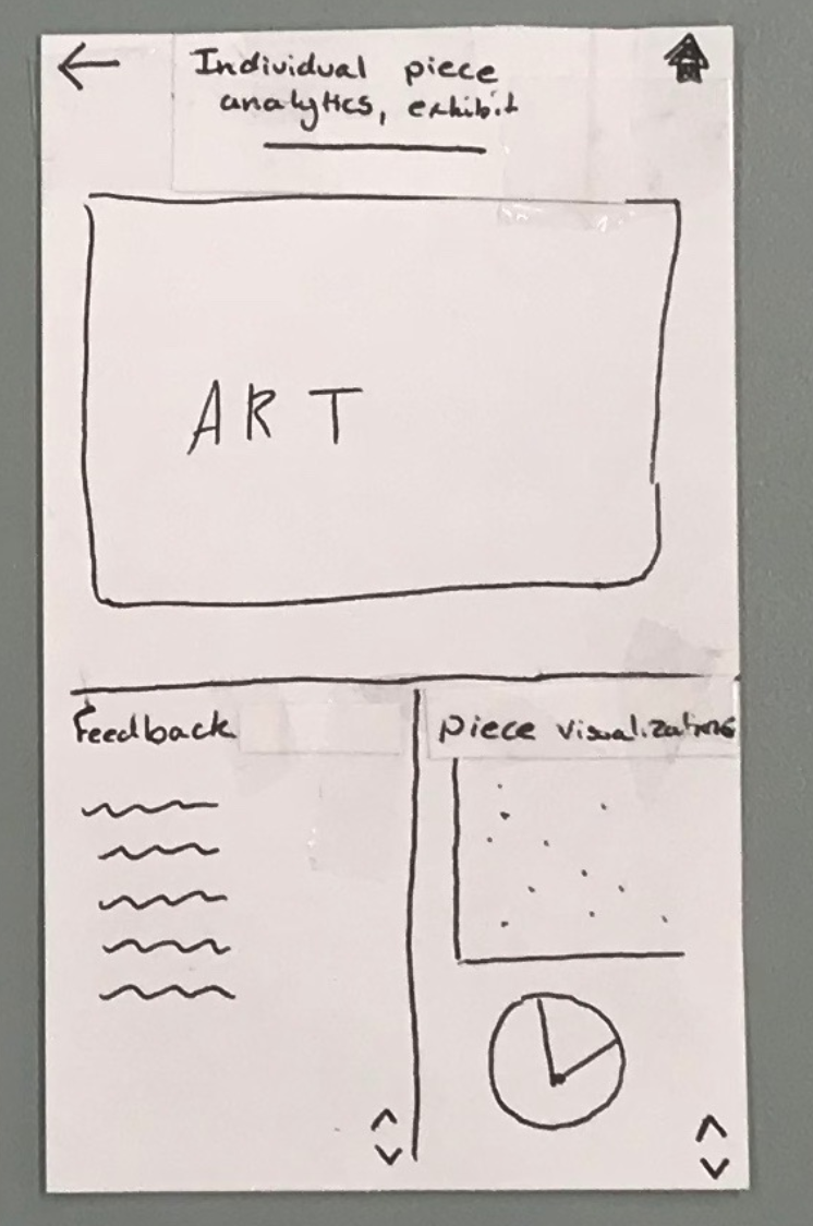
“Individual Piece Analytics” Screen (old, new)

Task Review
Note: As noted above, we realized that our tasks were either too specific and artificial, or too vague. Therefore, we have decided to update our tasks: 1) allow curators to get a better understanding of their visitors by providing more information about visitors’ behaviors and feelings towards certain exhibits/artwork, and 2) allow curators to communicate with visitors by giving them the ability to answer questions directly. After explaining these tasks to U3, it appears that we have the right combination of a descriptive task that isn’t just an artificial sub-task.
Task 1: allow curators to get a better understanding of their visitors by providing more information about visitors’ behaviors and feelings towards certain exhibits/artwork
The user starts at the home screen.
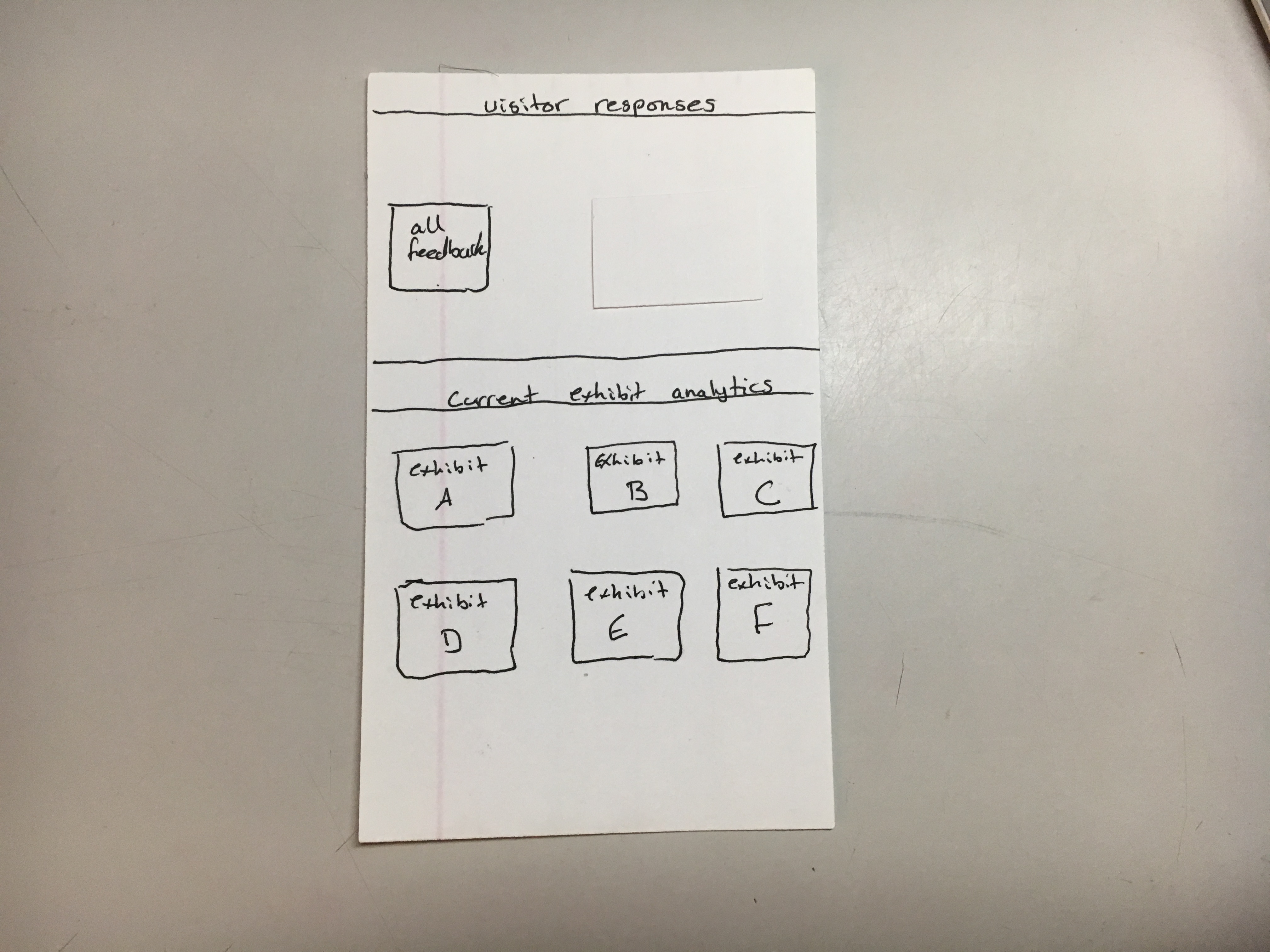
They then have a couple options from here: click the all feedback button, or click one of the exhibits listed on the bottom half of the screen. Let’s first say they click one of the exhibits. They will then be taken to the analytics for the exhibit they clicked, showing both the overall analytics for the exhibit and an alphabetically organized set of the artwork in that exhibit.
The graphs from the overall analytics are based on what we found are the most important and feasible pieces of information (feasible based on assuming we have visitor feedback data available, and important based on discussion with a curator). Now, if the user clicks on a specfic peice of artwork, they will then be taken to the artwork analytics page which shows the piece of art, and the same graphs, except using data for that specific piece work. Additionally, the emotional distribution graph might be confusing since negative emotion may seem like a bad thing, so there is a help button to explain that this might not be the case.
Task 2: allow curators to communicate with visitors by giving them the ability to answer questions directly
Now let’s assume the user clicks the home button to get back to the home page.
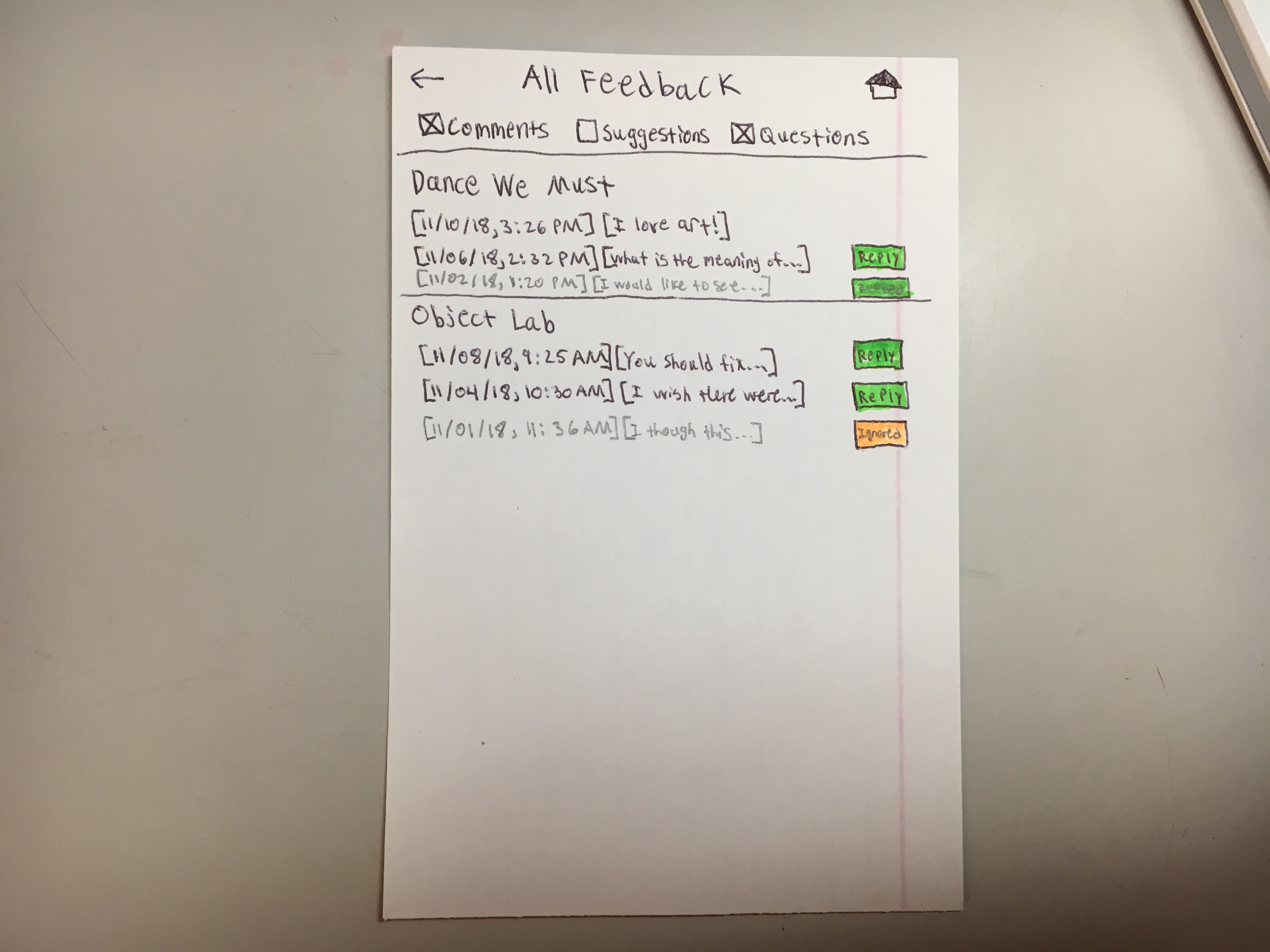
If they click the all feedback button then they will then be taken to the all feedback screen, showing them all visitor feedback from most recent to least recent, categorized by exhibit. We have also determined from our usability tests with UT2 and UT3 that there are 3 types of comments: questions, suggestions (not a question, but implies action should be taken), and general comments (these do not imply action should be taken). The user can then click one of the checkboxes in order to make certain types of feedback appear or disappear based on what they want to see.
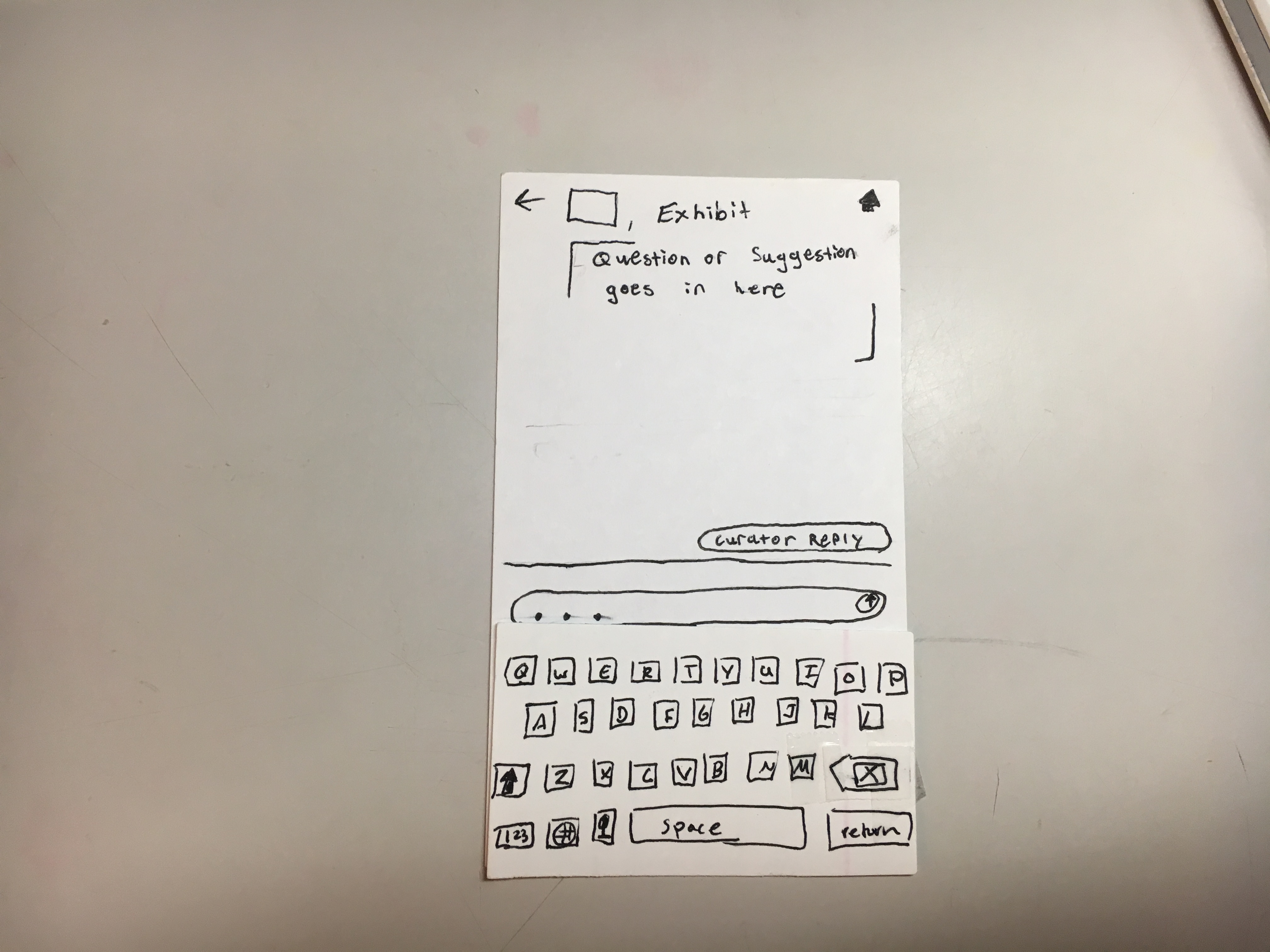
If the user wants to reply to a comment, they can click “reply” (“ignored” and “replied” are also still clickable, and take you to the same screen). They will then be taken to a response preview screen where they can see the exhibit/artwork and the full question. The curator can see responses from previous curators, edit those responses, ignore the question (which will mark the question as ignored), or respond to the question.
Let’s say the user clicks respond. Now they will see a response screen and be able to type and submit their response.
Discussion of Important Changes
Change to Data Analytics Display
We’ve mentioned this throughout the deliverable, but one of our biggest decisions was determining what data we should be displaying. Since vague data and graphs were not very helpful to the curator, we decided that we had to specfiy something a little more real. During our meeting with the curator, we noticed she really wanted to learn about the visitors and what they got out of an exhibit. Based on the assumption that we have visitor feedback data, we were able to create three graphs that we thought most effectively communicated this information. First, visitor satisfaction is a good overview of the feelings towards an exhibit. Second, types of comments gives the curator a sense of whether people are voicing their likes and dislikes. Finally, an emotional distribution let’s the curator know if visitors are experiencing the story that the they are trying to illustrate (e.g. if the emotional distribution is high on the negative emotion end, then we know visitors have feelings of sadness, anger, or some other type of negative emotion. However, if this is the emotion curators are trying to elicit, then this will show that they did a good job). By creating these illustrations, we believe that we are communicating the most important information possible to the curator (and we discussed these graphics with UT3 on a conceptual level). Additionally, we had thought about adding a customization option for graphs since we no longer have a general data analytics page. However, this would require additional usability tests and we are not sure that we’ll have the time to go through all the steps to make sure this is intuitive (creating a customization option essentially adds another task, and this could take multiple iterations to implement correctly).
Change to “All Feedback” Screen
After the usability tests, we realized that the all feedback screen was vague (relative to the questions and suggestions page) and the options for narrowing were a little overwhelming. After talking with the curator, we found that it was most important to be able to categorize by exhibit, and then they should be able to categorize by the type of question. We realized that the “all feedback” and the “questions and suggestions” pages were unncessarily redundant (we originally had both to make sorting easier, but we realized this didn’t really work). By combining the “all feedback” and “questions and suggestions” screens, we simplified the design, and made it much more intuitive. Additionally, we added time stamps in order to show that the information is organized by most recent to least recent (in the specific exhibit).
Artwork Analytics Organization
In our original exhibit analytics page, we simply had a list of thumbnails to let users know that they could click to get specific artwork analatics. However, to our users, this was confusing and a little overwhelming (they also didn’t know how these were ordered). We decided to categorize the artworks alphbetically to give a clear indication of order, and mention in the artwork analytics header that they can click on a piece. This makes the functionality clearer and more intuitive to use. Futher, since it would make sense for the exhibit analytics to be the highlight of the exhibit analytics page, we decided to flip the “exhibit analytics” section with the “artwork analytics” section.
Task Revisions
Finally, we were able to create a pair of tasks that seemed to adequately describe what we are trying to accomplish in our design. Even though it took us awhile to figure out this balance, we now have tasks that do a better job at encompassing the scope of our project. To summarize, here are our updated tasks: 1) allow curators to get a better understanding of their visitors by providing more information about visitors’ behaviors and feelings towards certain exhibits/artwork, and 2) allow curators to communicate with visitors by giving them the ability to answer questions directly.