first usability test
Our first usability test was with a student. UT1 is an econ major who has only been to WCMA once, but asks a lot of questions about the way things work. UT1 is a good friend of Malibu’s so she didn’t attend this test. We met at Lee’s because UT1 was finishing up dinner and had a short window of time in which to do the test. Each team member introduced themselves, and explained their roles. Landon introduced the project and took notes while Chris was the computer and performed the majority of in-test communication. Kenneth was going to take notes but had to leave unexpectedly. UT1 knows one of our classmates, so we found out mid-introduction that they had already heard about the project and assignment. Landon introduced the project as an application that will allow WCMA curators to interact with visitor feedback and exhibit data. He then described the two tasks that UT1 should try to complete, with as little help as possible. We also told UT1 that he should try to voice his thoughts outloud so we could understand areas of confusion, and give us a sense of possible improvements.
We found this exercise to be most helpful as a design review rather than a testing protocol review. While UT1 performed actions and talked through their thoughts, we identified aspects of the design that made navigation difficult. Some of the critiques were of things that had been recommended by technically trained testers, which is interesting. As the testing process unfolded we realized we needed to be prepared for users to take different paths to the same information.
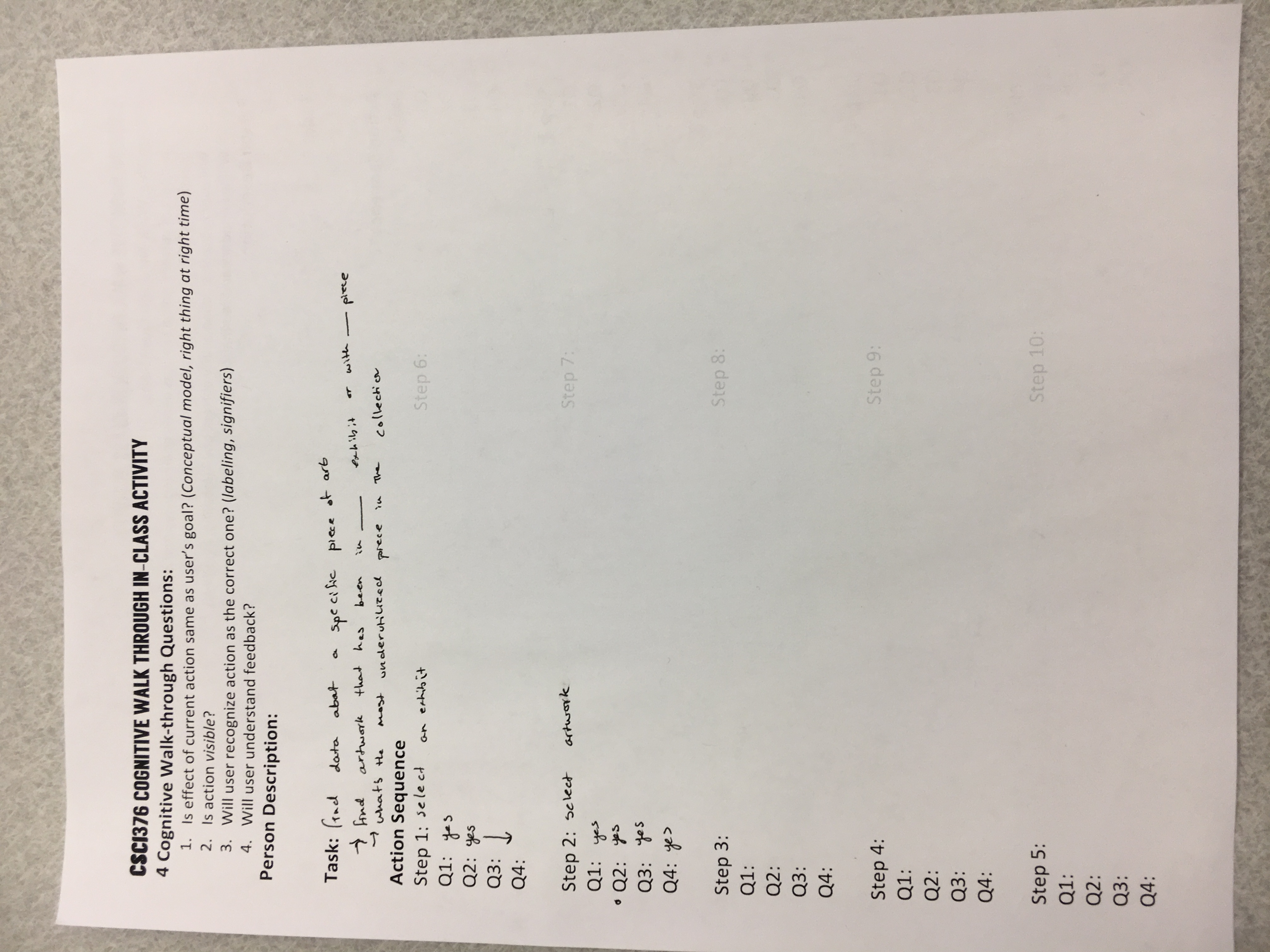
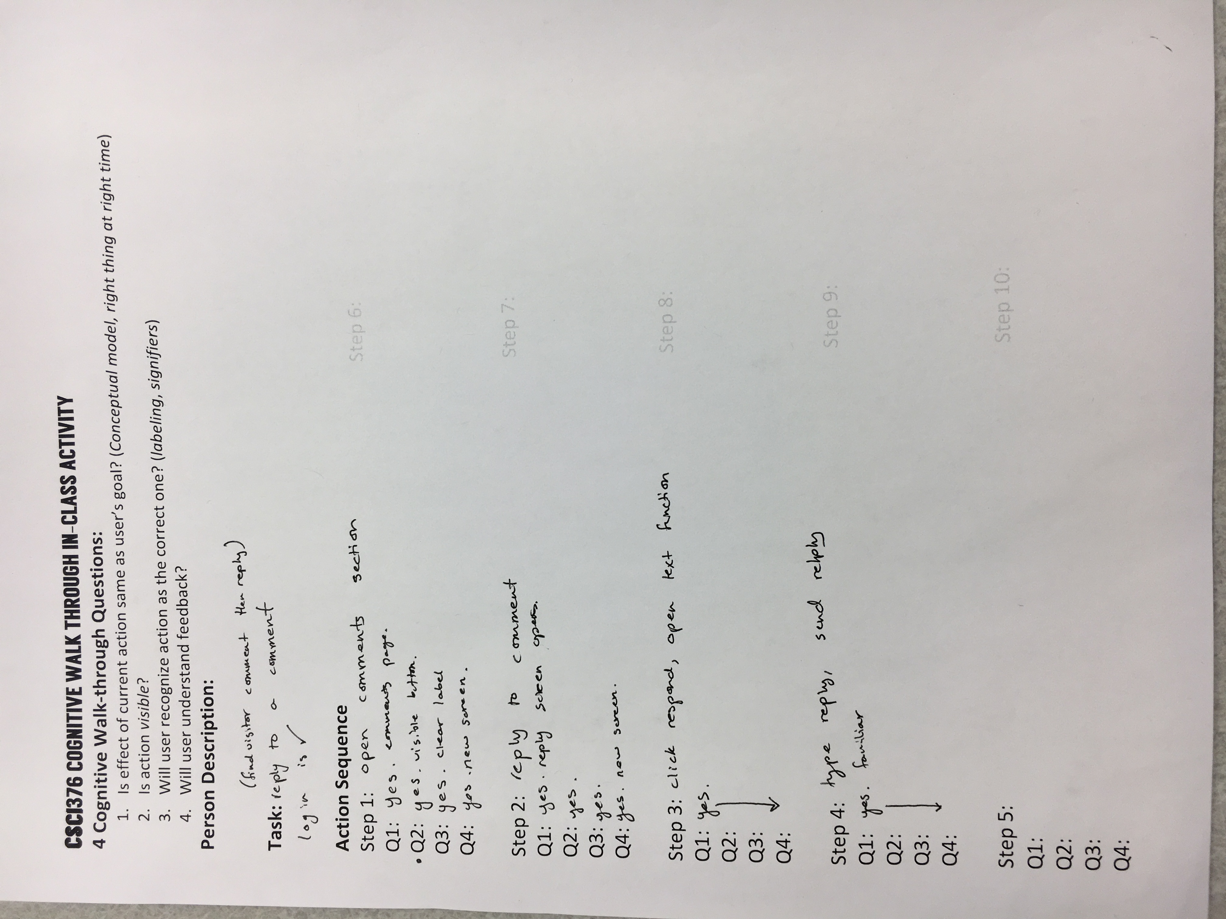
cognitive walk-through results
Our cognitive walk-through proved to be relatively unexciting because our hueristic evaluators were quite attentive to issues. A lot of their feedback fixed problems that otherwise would have come up in the walkthrough. We also may be too close to the project, because we weren’t able to come up with issues as we walked through the app. It may have been useful to do a cognitive walkthrough with an outside perspective. After our cognitive walkthrough, we decided to be more specific about the tasks we presented to people in order to help them navigate the paper prototype.
revisions from usability test
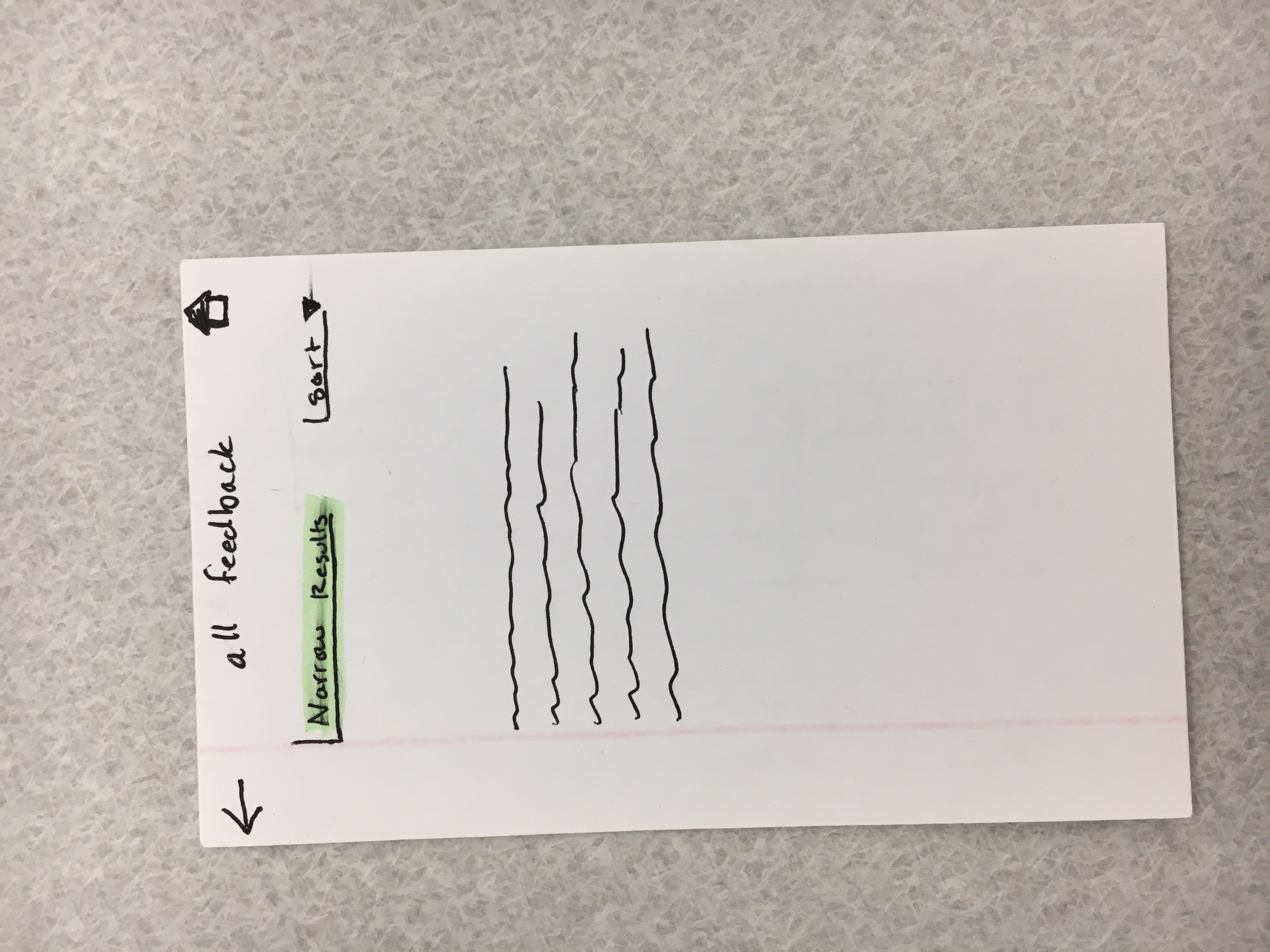
| Incident Description | Severity (if negative) | Image and Explanation of Revision |
|---|---|---|
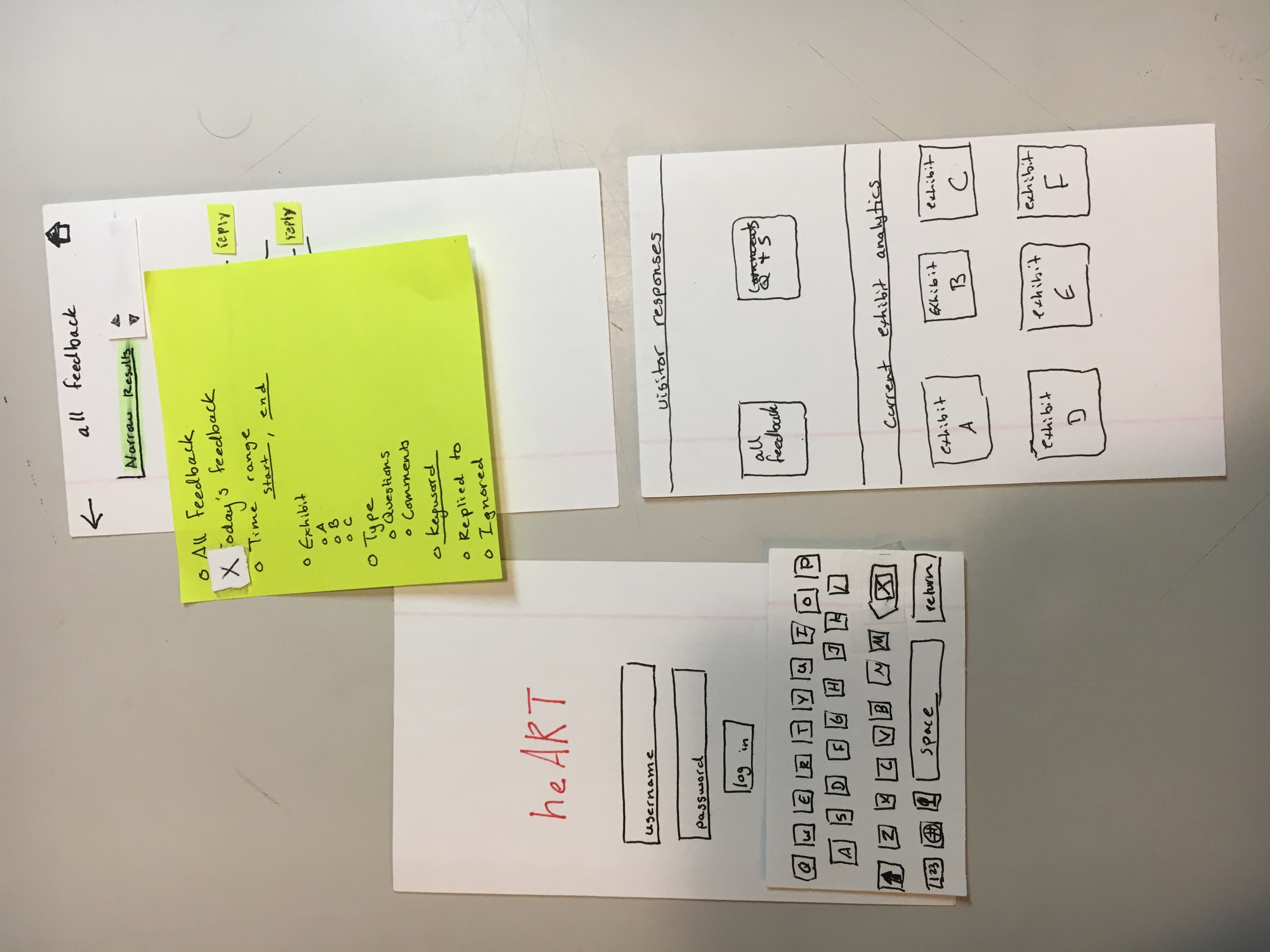
| Confusion about sort/narrow in “all feedback” | 2 | See image (number). Solution is to only have the “narrow” drop-down menu, with an up-down arrow next to it to indicate sorting. |
| Add “reply” button to questions and suggestions in “all feedback” | 3 | Add “reply” button to questions or suggestions that come up under “all feedback.” This takes users to the communication screens. |
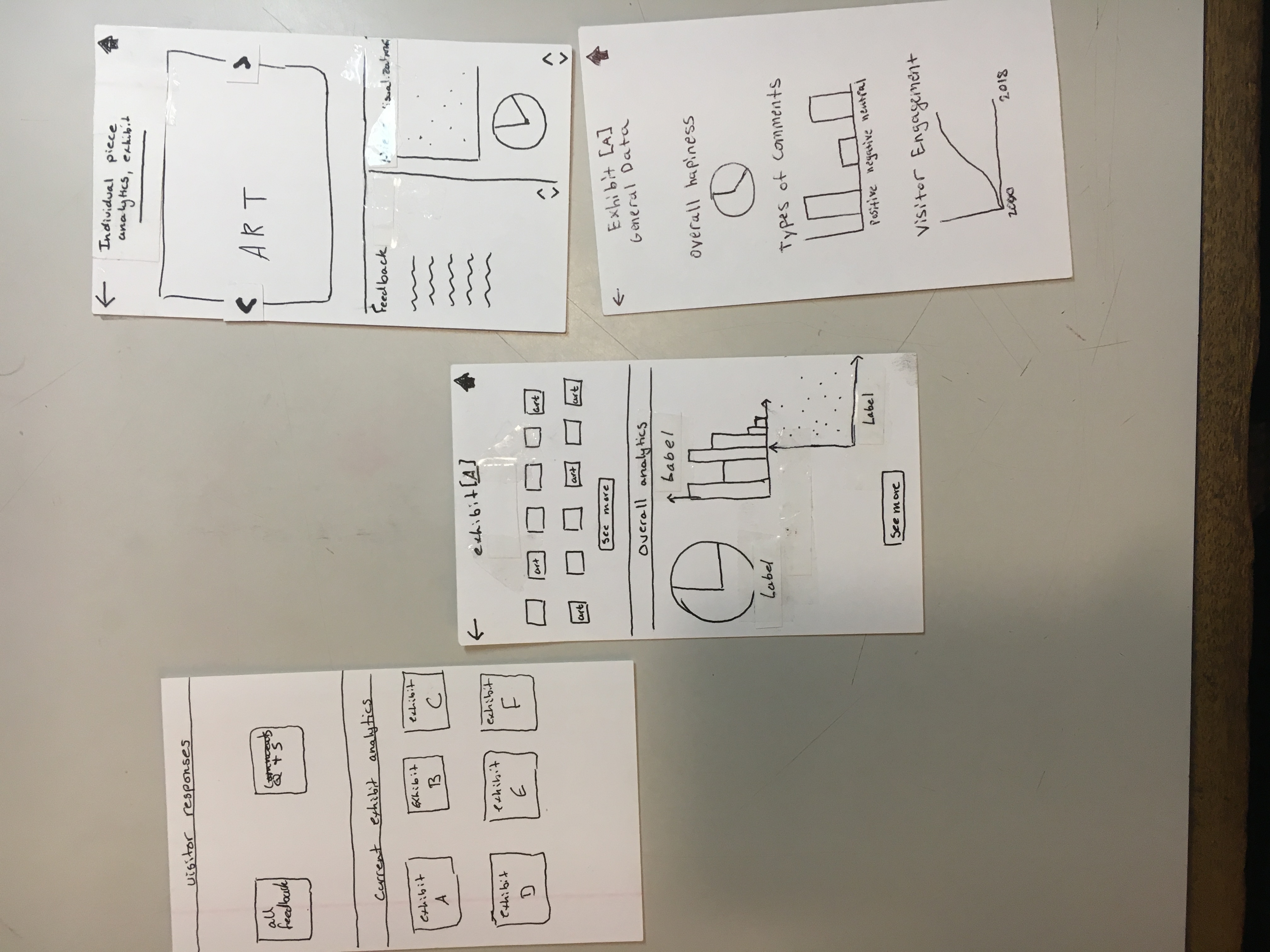
| Swipe through data viz on EXHIBIT [ ] screen | 1 | Add left and right arrow to indicate swiping ability. |
old paper prototype screens
new paper prototype screens
plans
Chris is trying to schedule at least one usability test with a curator, so we can get a better idea of what they want and need. We also intend on asking what kind of data they would like access to in the visualizations. Our goals are to identify design and process flaws, learn what curators would want out of our product, and discover any use paths that we didn’t identify or predict. Each team member needs practice at being the computer, performing introductions, and taking notes, so we will rotate based on availability. We will also probably attempt to do a usability test with a Williams student who is more of an art enthusiast. This way, we can get a sense of a more typical museum visitor and the type of information they might appreciate. However, we will still have them walk through the app with the idea that this is primarily for curators. Furthermore, this will be particularly helpful in addressing the communication of curators to museum visitors, as this will allow us to understand if this function is desired, and how we can improve it.
new paper prototype
To see original task walkthrough, click here.
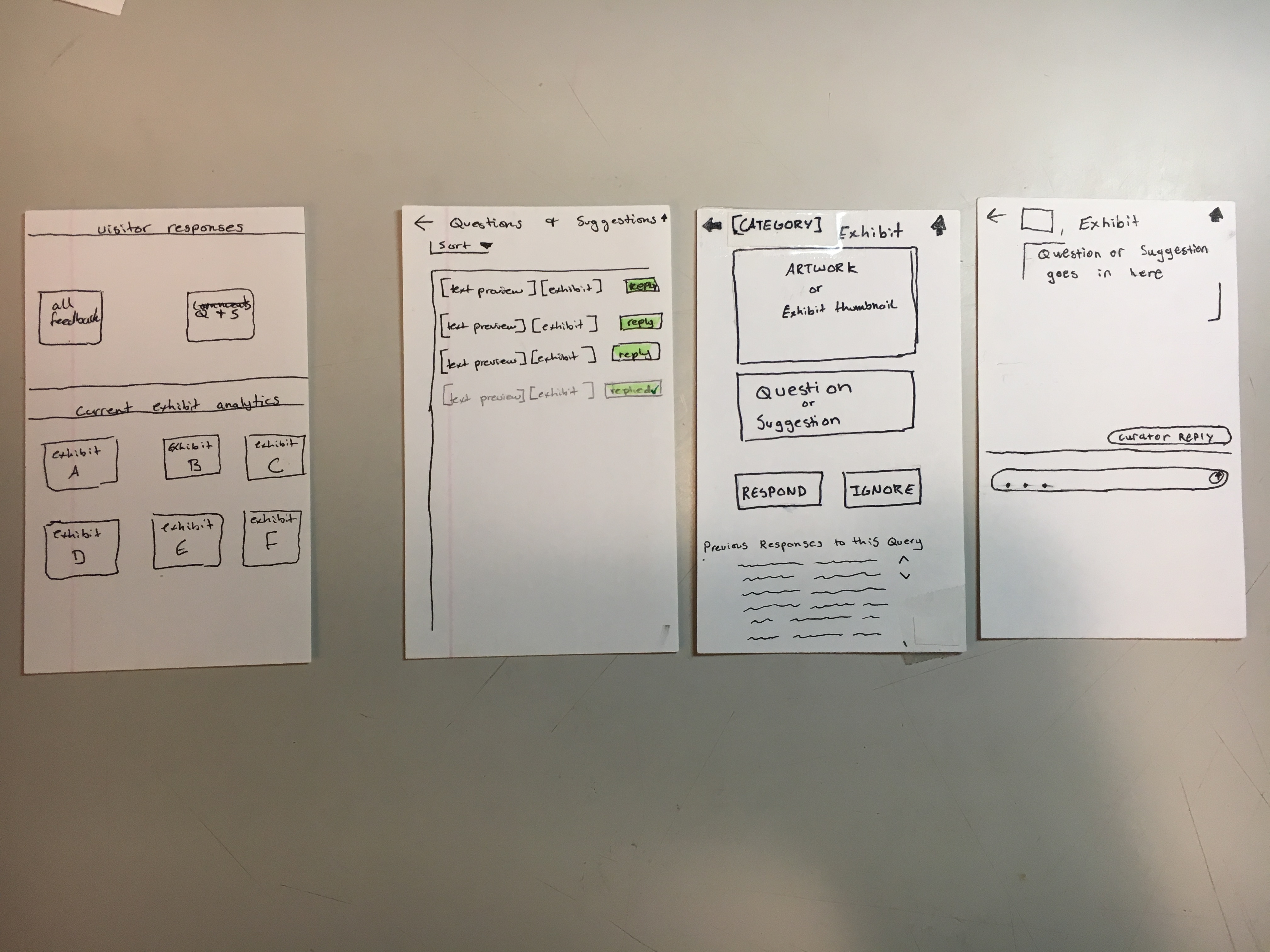
overview
Here is an overview of our mobile application design for curators.
Task 1: Summarizing and Communicating Data
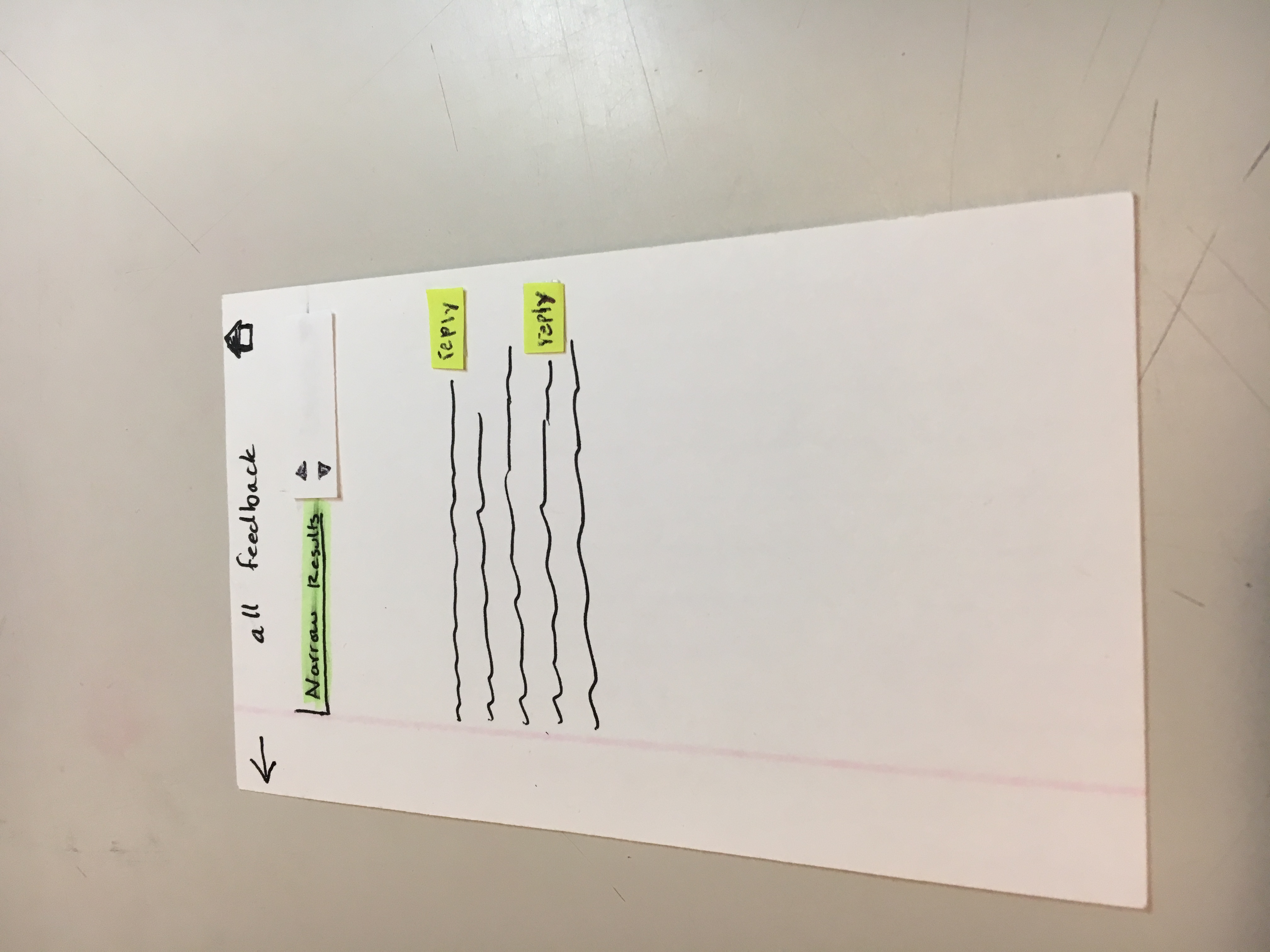
We have two ways users can access and visualize the feedback data. After logging in, the user will be taken to the home screen seen on the bottom right side of the picture. They then have a couple options from here: click the all feedback button, click the thought bubble icon, or click one of the exhibits listed on the bottom half of the screen. Let’s first assume they click the all feedback button. They will then be taken to the top right screen. This will show all visitor feedback from most recent to least recent. The sort button allows the curators to organize it from least recent to most recent. Additionally, there is a “narrow” field that results in a drop down, allowing the user to specify the feedback they want to see.
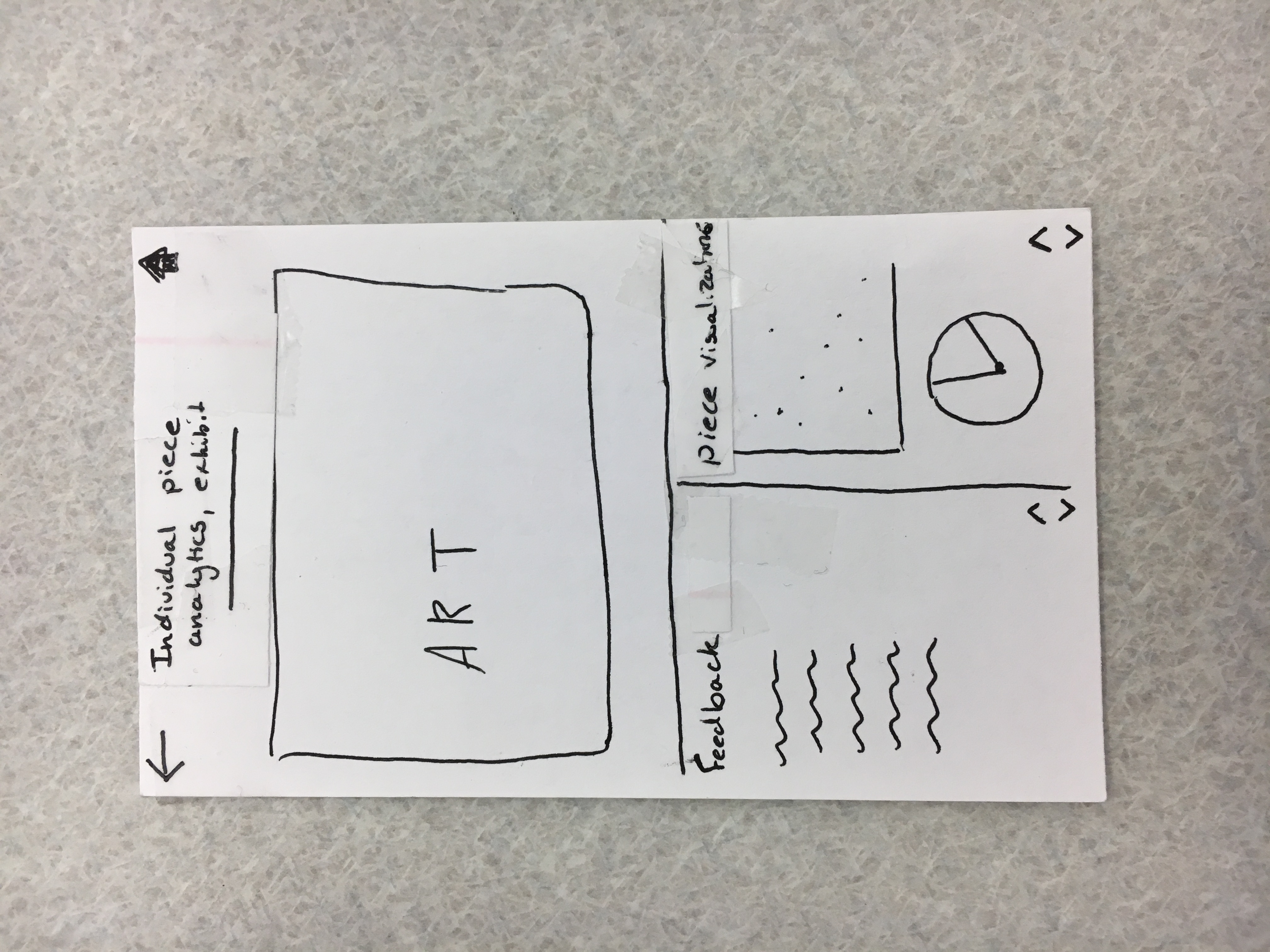
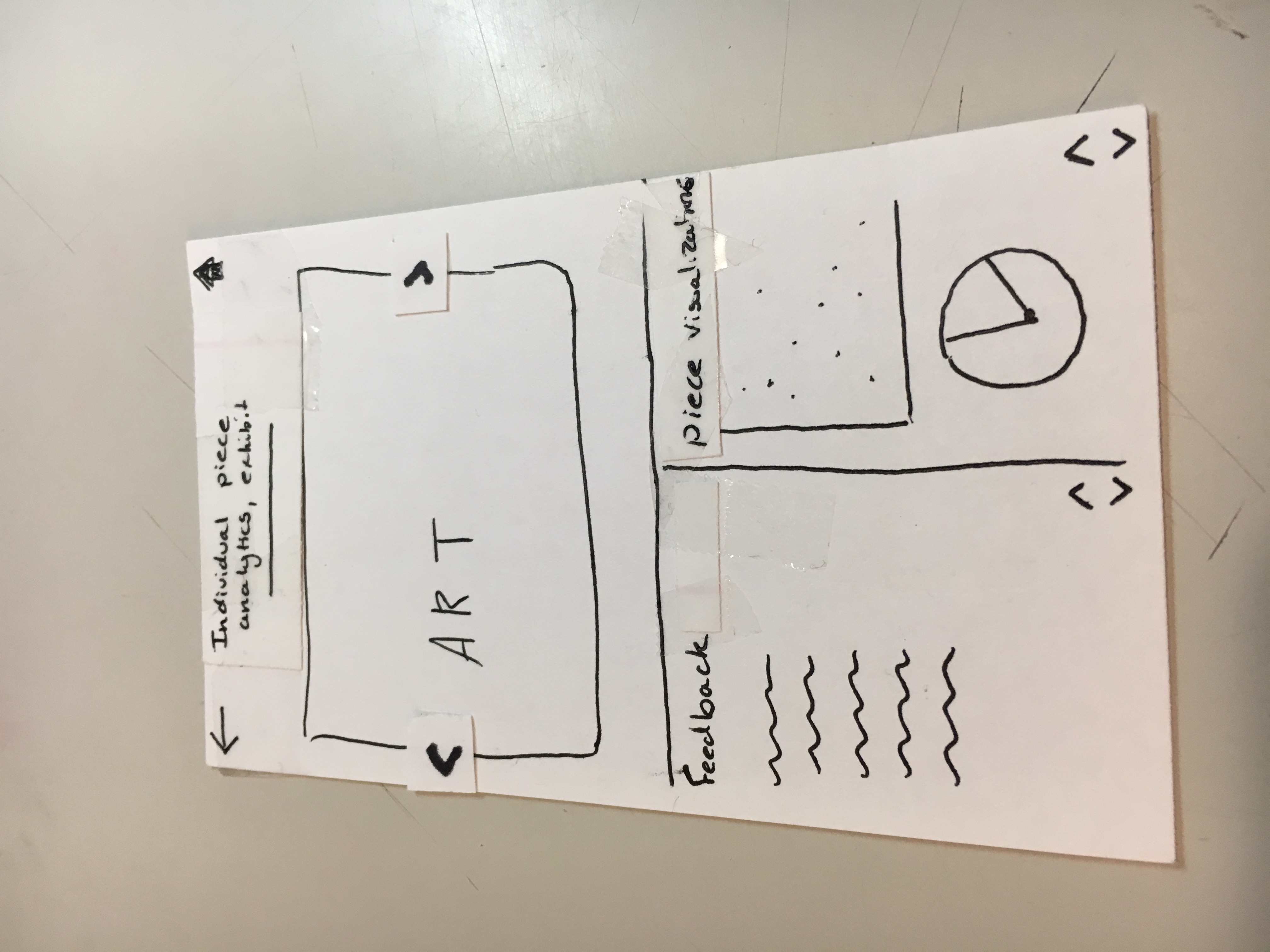
The other way users can see feedback is through specific exhibits. Assume we’re back on the home page and the user decides to click on exhibit A. They will be brought to the middle screen where they will see artwork that was most recently commented on in that exhibit, and data analytics (i.e. graphs and charts) giving them information about the exhibit as a whole. When they click on a piece of art, they will be brought to the top right screen, showing them the piece, recent feedback about the piece, and data/graphs specific to that piece. On the other hand, if the user clicked on the “see more” for the data analytics, they would be brought to the bottom right screen, showing them all of the data for the exhibit as a whole.
Task 2: Connecting Curators with Museum Visitors
Now assume we’re back on the home screen. If the user clicks on the thought bubble, they will be brought to the middle-left screen, showing them short notation of questions and suggestions (i.e. if the question is too long then it will be cut off) and the exhibit it is referring to. By clicking on one of the reply buttons, the user will be taken to the middle-right screen, showing them a picture of the piece of exhibit, followed by the full question/suggestion, and the option to reply or ignore it. By clicking reply, the user then goes to the rightmost screen, opening a chat window that lets them send a message to the visitor who asked it. Aside: since we are creating a design for curators as our primary user, we are ignoring the implementation of the museum visitor aspects. Therefore, for now, we are not worrying about how this response gets into the hands of the visitor.