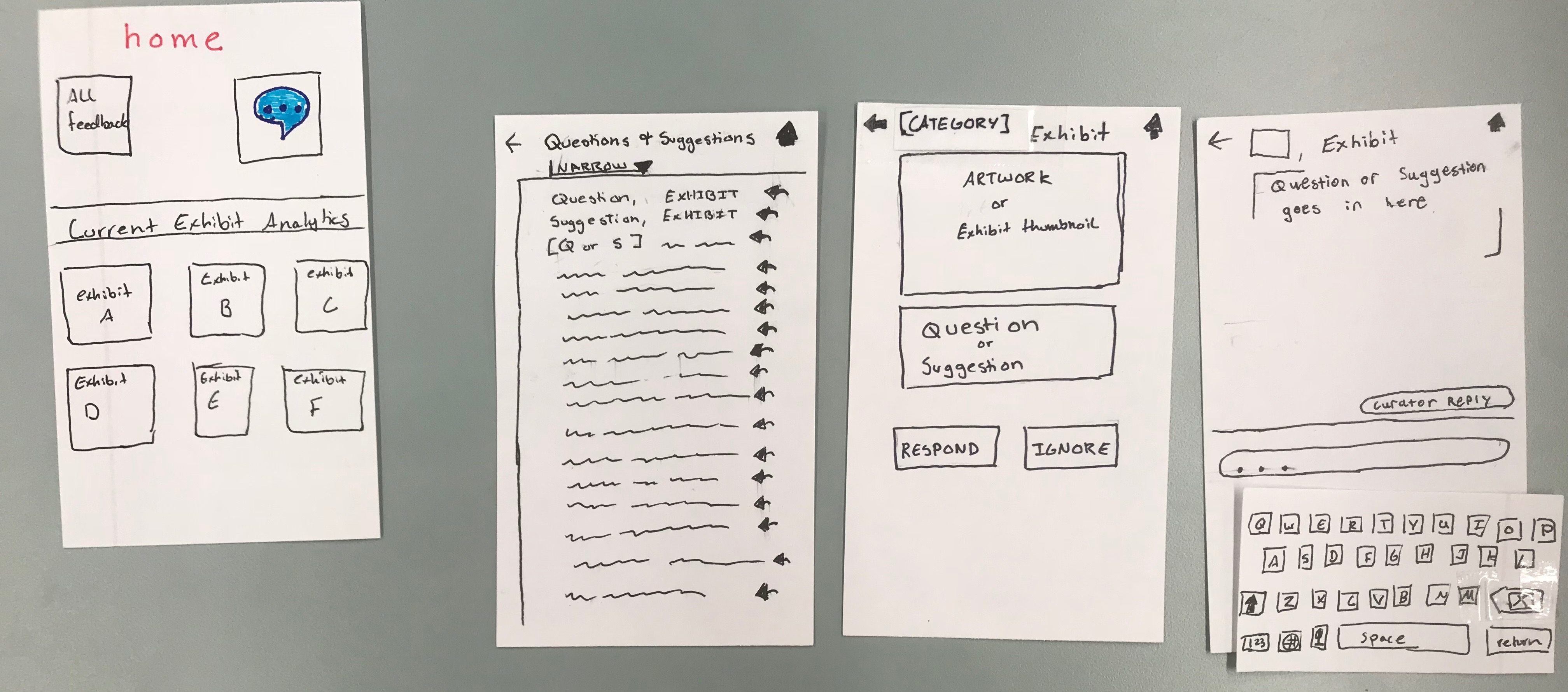
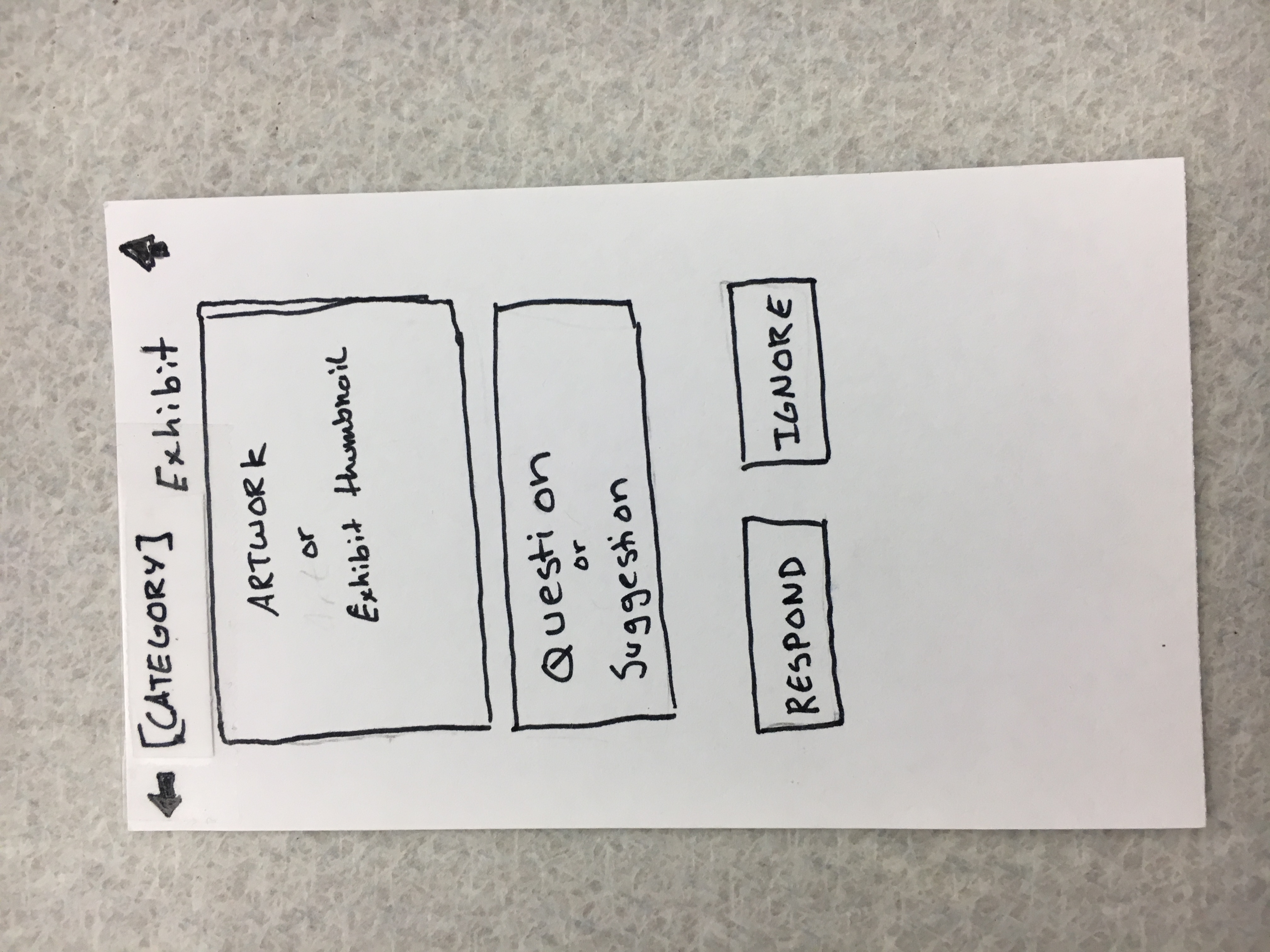
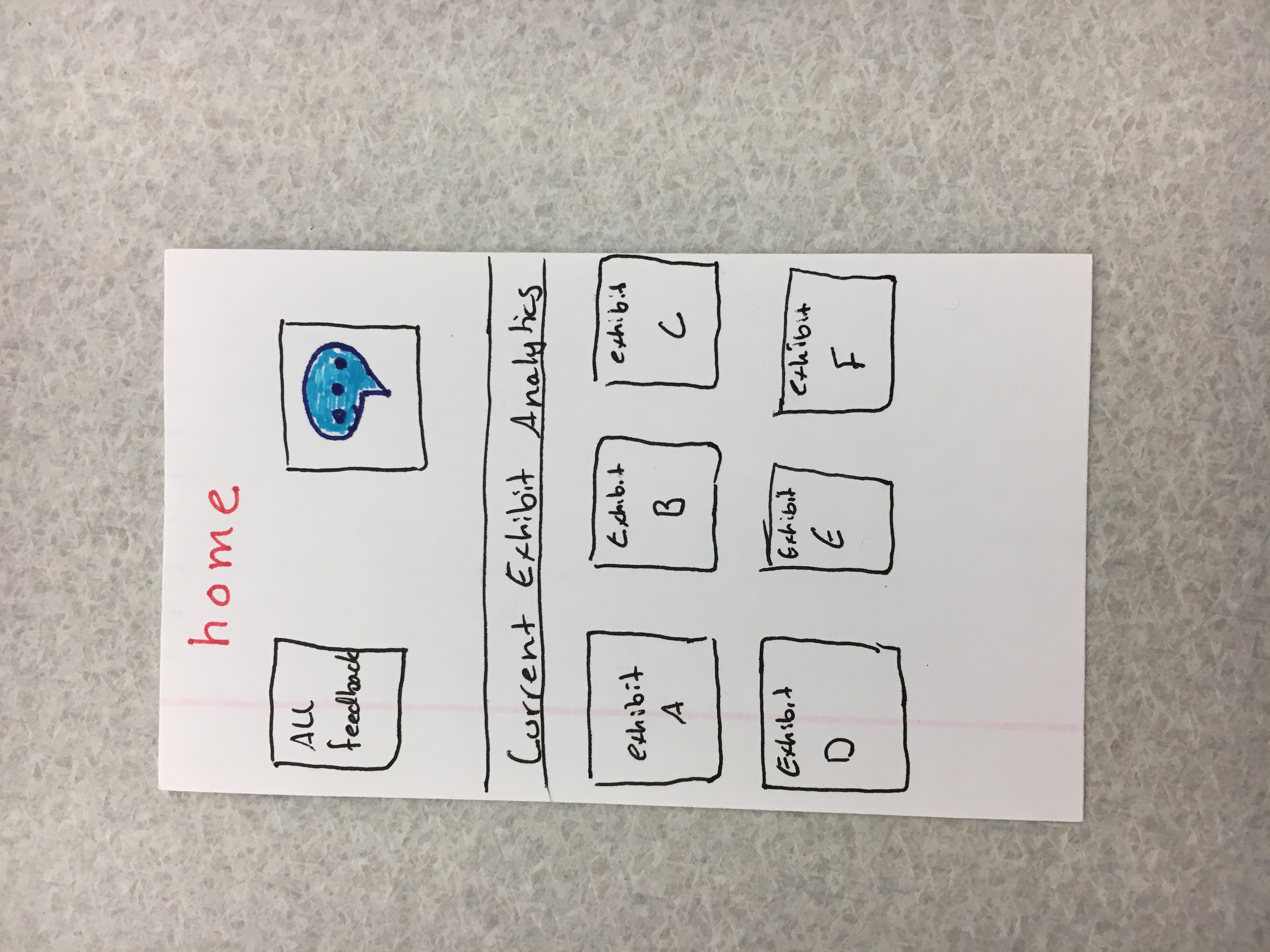
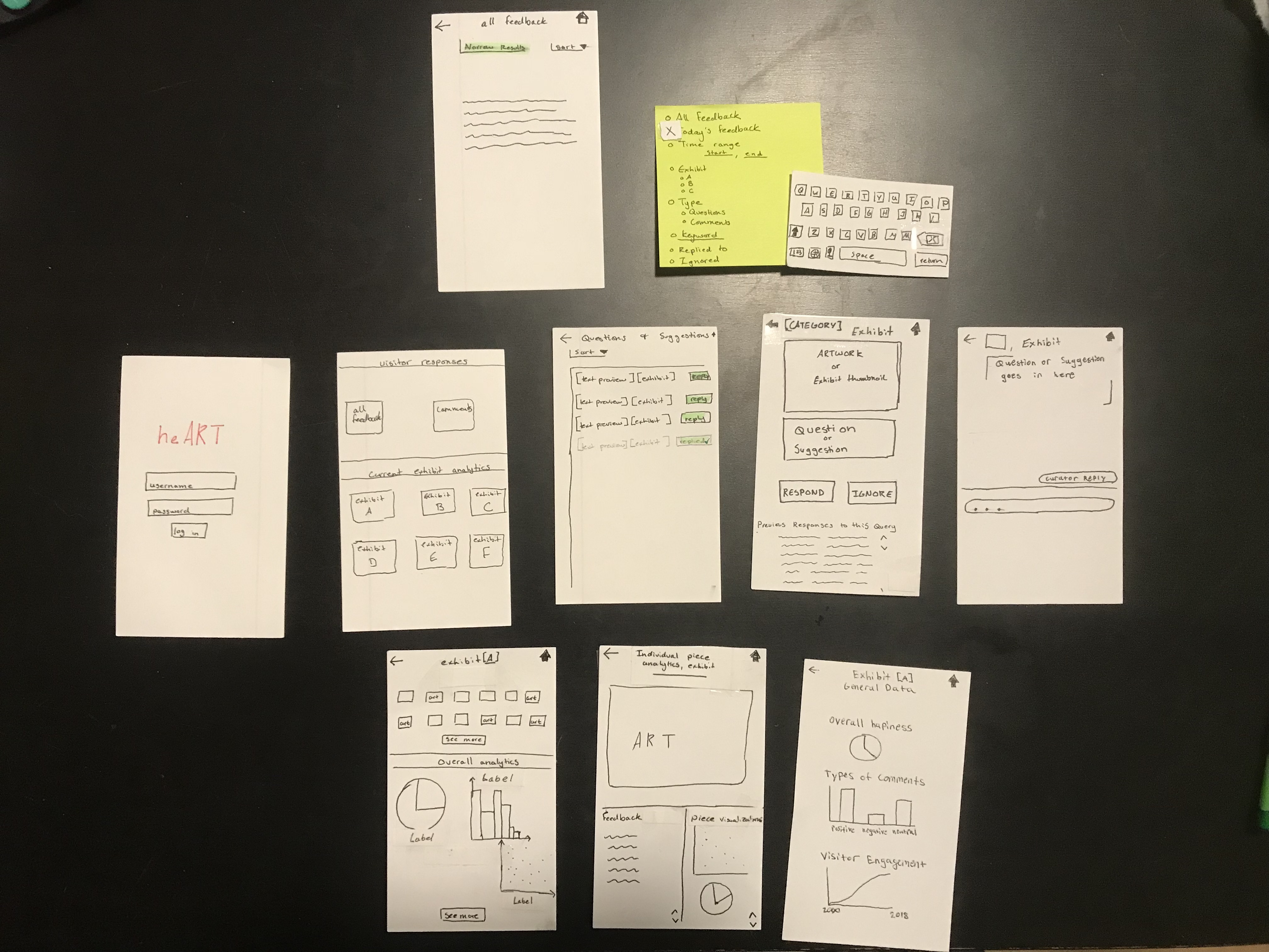
original design
The original multi-screen image is included because the singles are rotated, even though they weren’t in the original file.
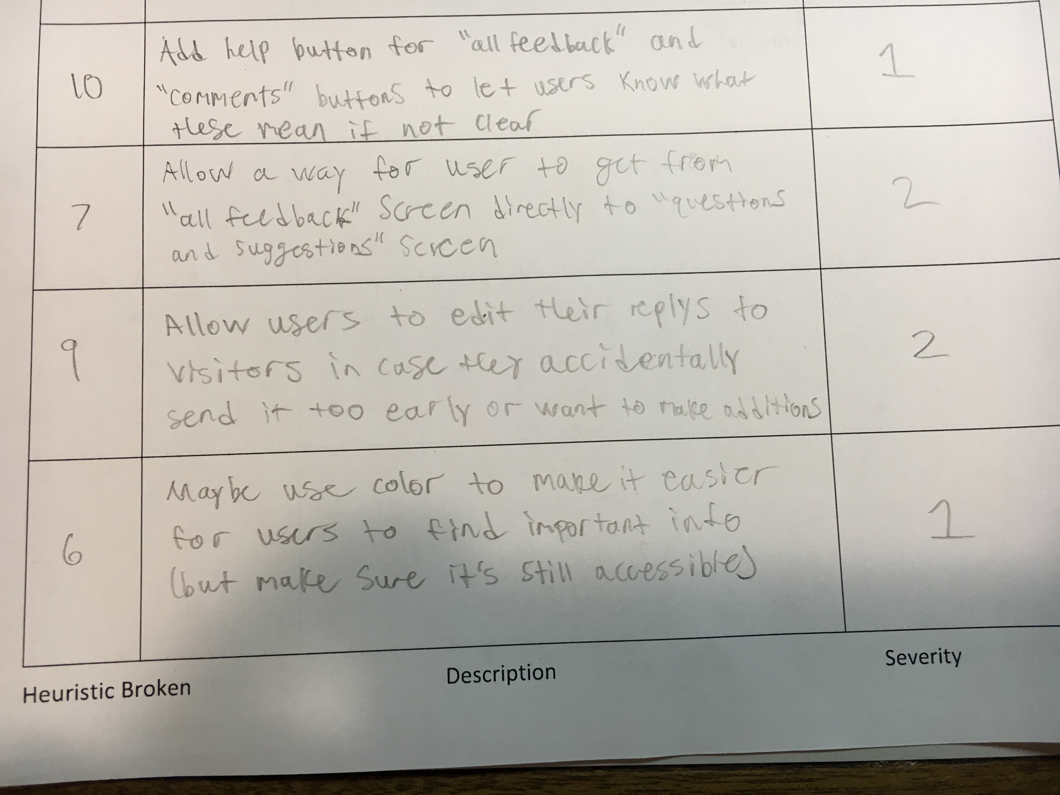
| Where Problem Occurs | Broken Heuristic | Problem | Severity | Solution | |
|---|---|---|---|---|---|
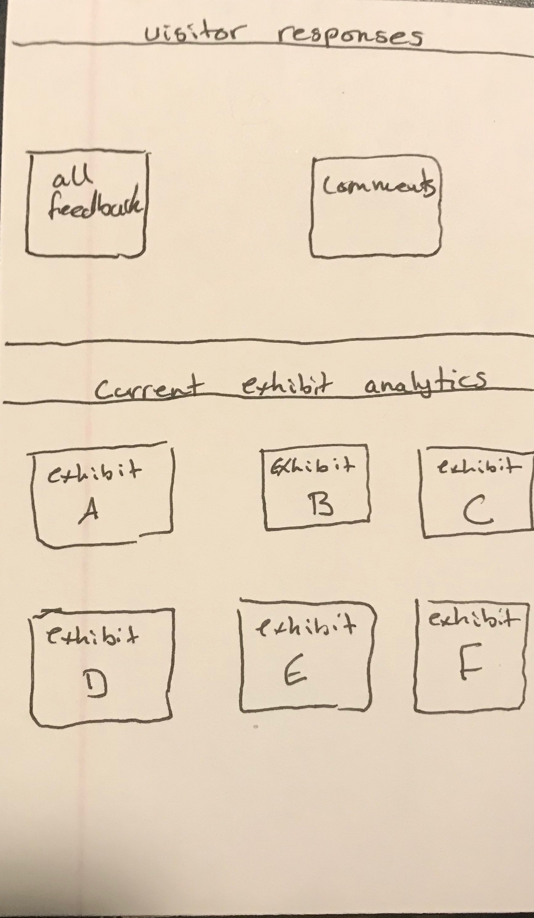
| Home Screen | Mapping and Metaphors | “Comment” icon on home screen is confusing | 3 | Add text to icon (call it comments) | |
| Home Screen | Recognition, not Recall | Not clear what category “all feedback” and “comment” buttons are under (need title similar to “Current Exhibit Analytics” that we use in bottom half of screen) | 3 | Add title | |
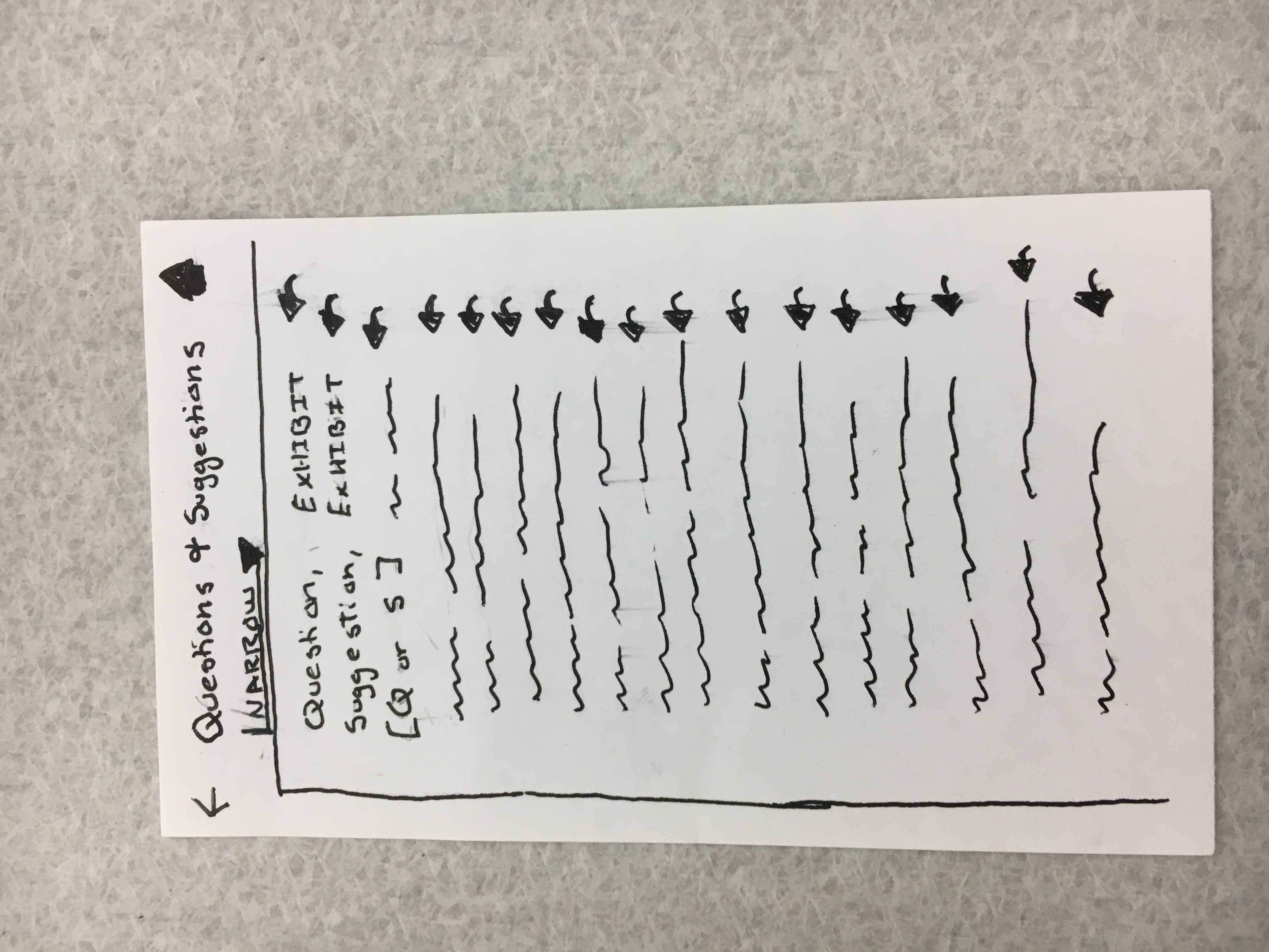
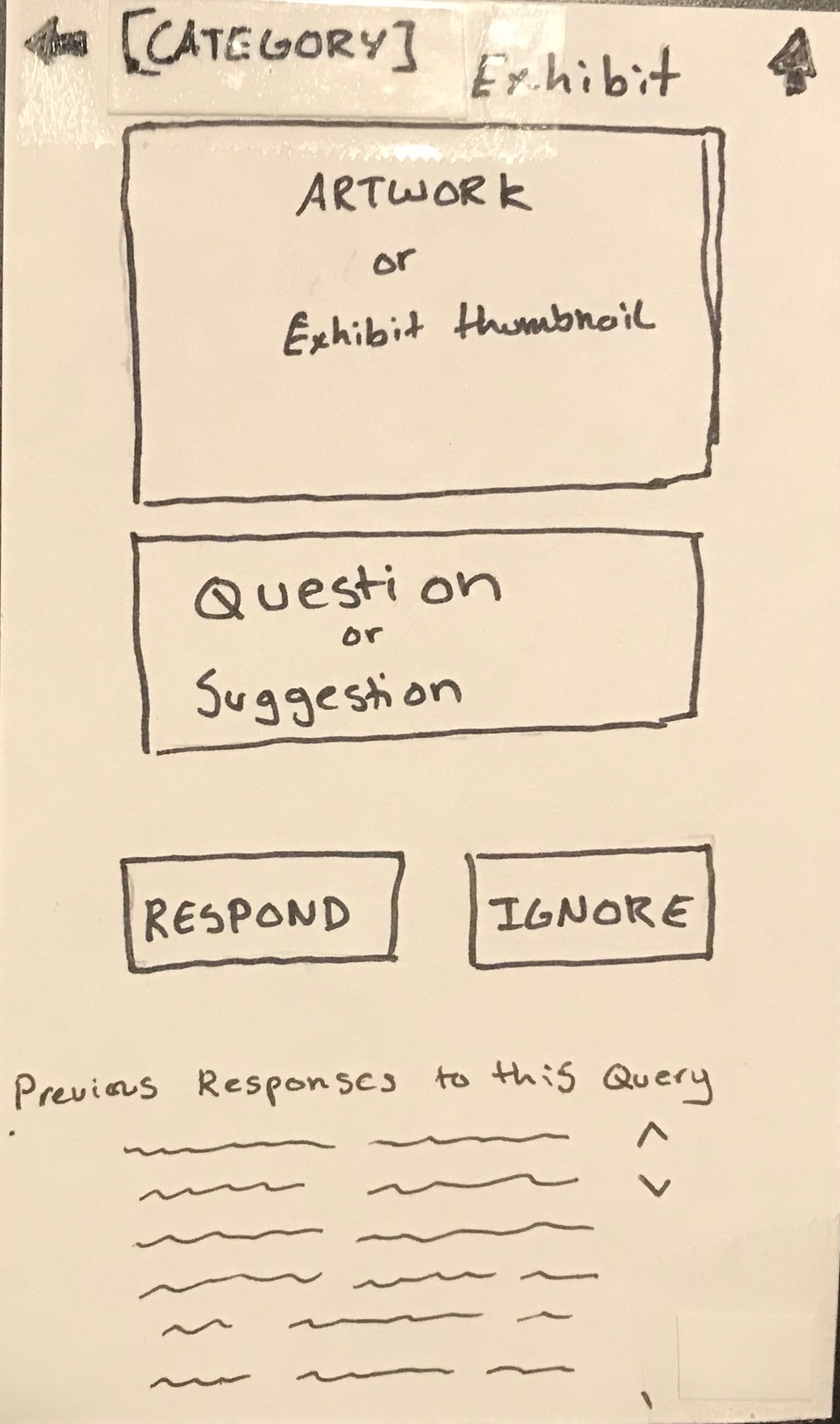
| Questions and Suggestions Screen | Simple and Natural Dialogue, Consistency | Not sure which questions and suggestions have already been answered | 2 | Add some indicator (like greying out of question) to show it has been answered. Also show previous answers, when curator clicks on a question. | |
| Questions and Suggestions Screen | Consistency | Too much if all questions and answers are shown. It’s a little overwhelming. | 2 | Add a filtering system: categorize by keywords, or have them search for keywords. Exhibit, type of question, type of suggestion, etc. | |
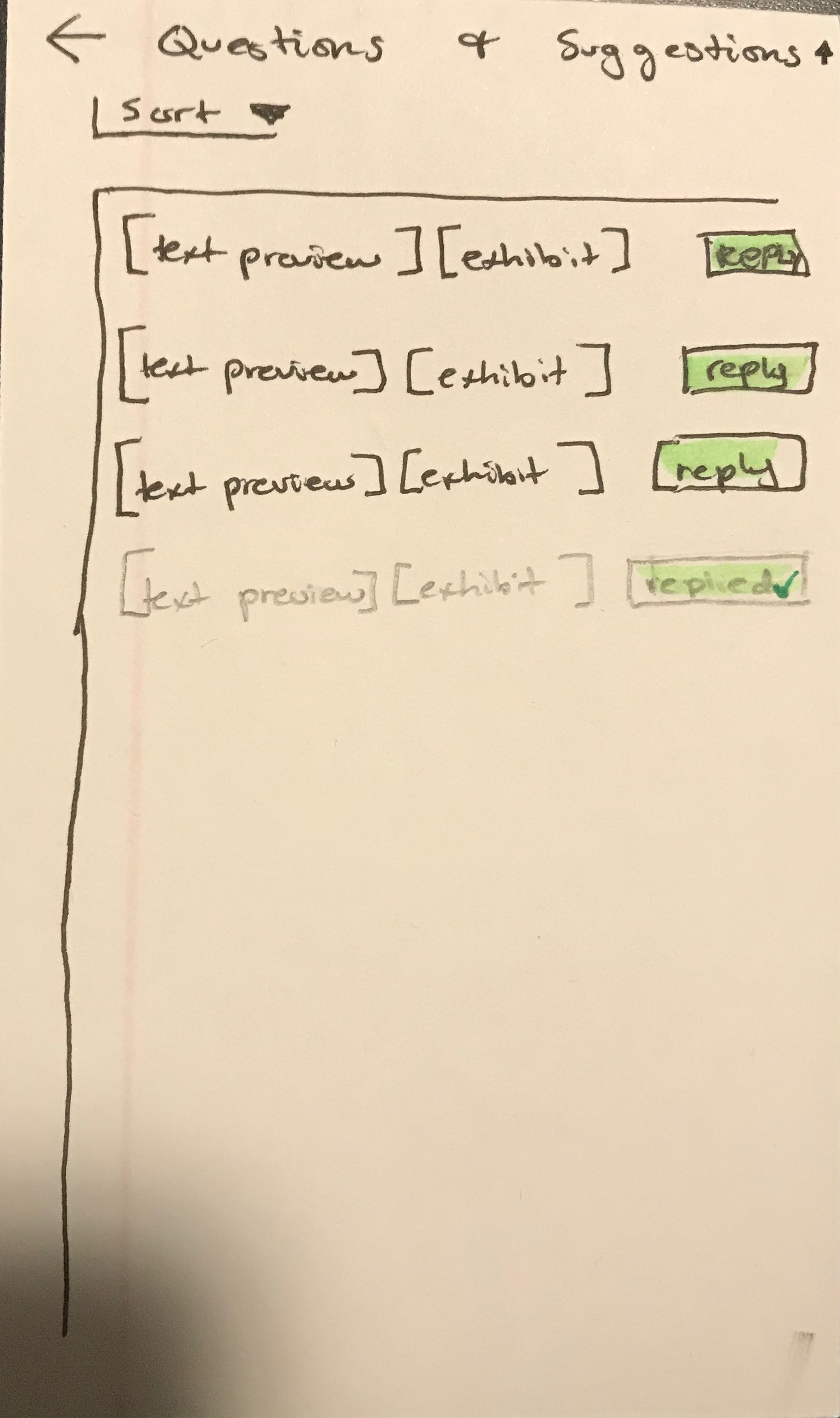
| Questions and Suggestions Screen | Consistency | Unclear on how to respond to questions. Click on the actual question or the reply button? | 1 | Perhaps have a “reply” button instead of the arrow so that it can be clearer. | |
| Ignore/Answer Questions Screen | Error Recovery | No undo button if user accidentally hits ignore on a question (assuming it goes away) | 1 | Perhaps add an undo functionality. Decided comments don’t get deleted. Can now search by “ignored” | |
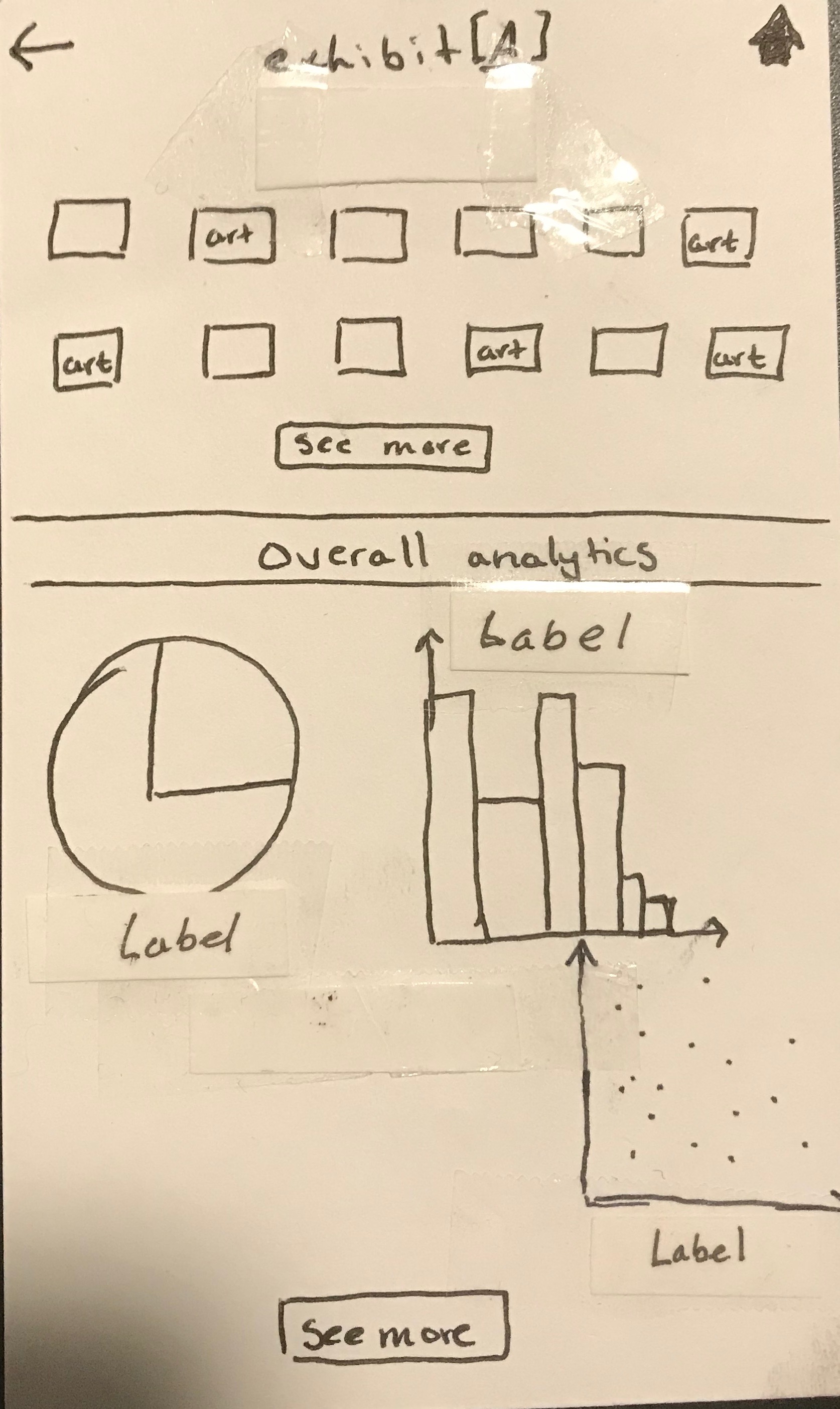
| Data Visualizations | Simple and Natural Dialogue, Consisteny | Data viz is unclear, no label. It’s not specific about what it’s showing, and is a bit overwhelming. | 3 | Put titles in every visualization as well as labels to indicate what that means. Perhaps a help button. Implemented labels to start. |
modified design
Changes made:
- Added text to home screen in place of comment icon
- Added feedback home screen category
- Added identifiers for (un)answered questions on the Questions and Suggestions screen. Did so by changing the color of text on answered questions.
- Changed reply indicator. Instead of an arrow there is now a “reply” button. On addressed questions, “reply” button has been changed to “replied” with a small green check.
- Added filter by keyword for drop-down “sort” menu. This allows circumvention of a “delete” or “restore” function. Instead, people can search by answered or ignored.
- Added data viz labels
this is our overall modified design:
This is our modified questions and suggestions screen:
This is our modified data visualization screen:
This is our modified home page:
This is our modified ignore/answer questions screen:
paper heuristic eval
We only got two evaluations done for some reason, but both are included below. Same issues with auto-rotate. First evaluation: Chris was the computer, Kenneth took notes, and Landon tested MUSE’s product. Dana from MUSE was the evaluator. Second: Kenneth tested MUSE’s design, Landon was the computer, and Chris took notes. Jamie from MUSE was the evaluator.
Chris’ Evaluation: